Final typography tutorial 


For our final typography tutorial with Nick we were instructed to recreate our text ideas to a large scale for display in the creative arts building. We used markers and paint to recreate the designs in the studio then we took them to the bottom of the Creative Arts building to be photographed from the upper floors. This was a good practice as it allowed us to practice on making larger scale versions of original works by using proportion and care, and the end result looked interesting when displayed on the Creative Arts floor.

Emigre Magazine

emigre-70_i2

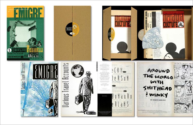
Emigre magazine emerged when modernism and postmodernism were in full swing, around 1984 (and until 2004). In tabloid format, it contained a vibrant mix of text and graphics and as time went on it was shrunk into magazine format, establishing itself as a text and graphic hybrid orientated magazine.

It was created by Rudy Vanderlands and Zuzana Licko.

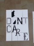
The original focus of the magazine was on Emigre designers (designers that live and work away from their country of origin). They wanted to grasp the response of an outsider towards the graphic design world. The magazine focuses on liminality, reading between things such as cultures. Because of the magazines disorder, it became a primary material of anti-modernism.

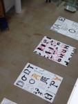
The collaborative approach meant that it was hard to pin down a style. However the magazine is responsible for many networks both technologically and critically engaged, through unique publications and transformative graphic language.

The magazine was very critical of modernism and feared its return; the collaborate efforts of Vanderlands and Licko formed a post-modern way of working, in which other designers were brought in which moulded Emigre as a host for postmodern orientated designers, such as David Carson and Experimental Jetset.

It was very technologically engaged, being the first magazine to experiment with Mac computer technology. The stylistic diversity of the magazine called out to postmodernism; it was difficult to develop a style or structure.

However the magazine primarily received negative feedback:

Masimo Vigrelli (neo-modernist):
‘national calamity’ ‘aberration of culture’

Stephen Heller (middleground design and jounalism)
‘Blip in the continuum’ ‘cult of the ugly’

Carson (postmodernist)
David Carson was angry because Emigre began to develop a certain look or style, and he felt that the magazine should always stay random. Ironically however, he popularized the style.

Beach Culture Mag
Boasted in one issue that they contained ‘No Emigre Fonts’, although the logo was rendered in ‘Senator’, a font by Zuzana Licko

Client Work – Easter Weekend

EASTER WEEKEND

For my usual client, the Heritage Inn Pubs, I was commissioned this morning to create a poster advertising the Easter weekend they are hosting. which intends to advertise events that are happening over the Easter period. I was given a document which contained the correct information about each individual pub, and the task of making a bright and colourful poster with an easter theme. I decided to use bright colours and large, curvy text, with handwritten styled secondary text. I also created a graphic of a cracked easter egg for the background. Again I had to use the twitter and Facebook logo, as well as the logo for the Heritage inn.

I am interested in…Adobe Sketch

Adobe Sketch is a program created by Adobe and is available on the creative cloud. It is an app which automatically scans pictures using the camera and creates vector images based on the photos taken.


The image is scanned and the draw-able elements are collected and highlighted in green. Areas that do not want to be drawn can be erased  by tapping them.

Whilst the image loads the vector is drawn.


Images created can then be stored within the library for use in other Adobe programs. This program is really useful as it allows drawn  images to be traced exactly and turned into a vector without having to fuss over scanning images and importing them. Adobe sketch is available as an app on the app store.

Experimental typeface

Extending from the typography workshops I decided to create my own typeface, which I constructed as a drawn piece using individual objects. I completed the drawing using a 0.1 fineliner and pencil to sketch the shape of the letter. This type is intended to be a display text which I drew to practice and experiment with drawing.

Manual type workshop


In Monday’s workshop we completed a session creating our own handmade type. This was similar to our previous workshops with Nick, however we were instructed to sketch a full typeface using the grid provided. I experimented with sketching lettering designs and colouring the letters, and I then defined the type by enlarging the letters using the detailed grid. i used pencil and fine liner to construct my letters.