Bradbury & Blachard Gallery Sheffield – ‘Rumble in the Jumble’ – April 30th


As part of our Sheffield Trip we visited an exhibition called Rumble in the Jumble by Bradbury and Blanchard. The exhibition consisted of works by Kid Acne and included a jumble sale of tshirts, flyers, records, fanzines and prints.

B&B is an independant screen print studio programme founded by curators and artists Bradbury and Blanchard. It is located within Sheffield’s Cultural Industries Quarter, promoting the work of emerging and established contemporary artists through periodic exhibitions, fanzines and off-shoot projects around the world.

The gallery was very interesting as the prints were colourful and abstract, but at the same time they were quite comical. As well as the exhibition the artworks were on sale through magazines and vinyls for something unique to collect. I liked the use of harsh black line drawing on coloured backgrounds,  giving the art a bold, edgy feel that is outstanding and memorable.

EvolutionPrint Sheffield Studio Visit – 30th April 2015


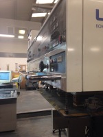
Today we made a visit to Evolution Print, which is a printing specialist based in Sheffield City Centre. It is named as a premier printing house and the company is headed by Jonathan Newbould & Graham Congrieve. The print shop employs 38 people.  They work for clients of gigantic range and for a wide variety of projects, aiming to provide the highest quality of print. Their print equipment includes:

  • Five Colour & Coating Unit (Infra-red Drying) Heidelberg Speedmaster XL75 B2 – Image area 700 x 500mm
  • Five Colour Komori B1 Lithrone with PQC and Coating Unit (Infra-red Drying) – Image area 700 x 1000mm
  • A3 Heidelberg GTO Offset Machine – Image area 300 x 430mm
  • Ricoh Pro C751 Digital Press – Image area 297x420mm
  • Ricoh Pro C901 Digital Press – Image area 297x420mm
  • HP Designjet Z6200 Photo Printer

The company also caters for other print finishing purposes as well such as folding, cutting and collating.

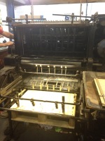
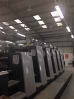
The tour around the warehouse proved very interesting; we got to see the printing process of the Heidelberg Speedmaster whiich is one of the largest and most expensive printers in the world. The printer produces high glossy prints and can print over 3000 pieces per hour. The paper is loaded using a forklift and once the printing is complete the same heavy stacks of paper are taken to be laser cut.

We also learnt about the custom cutting machine, in which custom shapes can be created using foam mounts and thin blades. Designs are fed through the machine and the custom shapes are cut out; it can be used for designs that require a finished shape other than a rectangle.

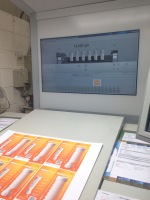
Pantone colour charts are also used when communicating with clients. Just like choosing a colour of paint, the Pantone colour book shows the correct colour of certain combinations of ink. A client can select a specific colour and these amounts can manually be entered into the printer so that the correct shades are produced.

This visit was really valuable to me as it made me think more about the printing process and its complications, but also what amazing technology is available to achieve the print required. It also taught me about the value of high quality prints, and made me consider the fact that high quality prints are important to the status and professionalism of a company.

I am interested in…Sagmeister & Walsh

Sagmeister & Walsh is a design studio based in New York, run by designer Stefan Sagmeister and Jessica Walsh. Sagmeister has worked for The Rolling Stones, The Talking Heads, Lou Reed and The Guggenheim Museum, and his work has been presented in New York, Vienna, Berlin, Paris, Seoul and Prague to name a few.

Walsh is a designer & art director, and her work has won awards from the Type and Art Directors Club, SPD and Graphis.

The NYC design firm creates identities, commercials, apps and websites for themselves and for clients. They do everything from Advertising to web design to furniture design. They value commercial products as something that is worthwhile with a reason to exist and a reasonable timeline & budget. The studio started out small with only a couple of clients which then built up to becoming more noticed. The studio was originally designed to cater to music clientele, however it was only after a year that they had completed their first work for a music client.

They believe that graphic design is better produced when working together within a small team. Sagmeister defines success in terms of being a graphic designer as being enabled to do the kind of work that is enriching for the audience, the client and the designer, and also being able to change directions so new challenges and growth are possible and boredom can be avoided.

The work of Sagmeister and Walsh interests me greatly because I like the clean, modern approach to client work and the interesting way in which designs are executed; they are simplistic but clever giving them an edge. I feel that the designs have definitely influenced the way I work as I feel that my work looks better when given a simplistic approach.

Client Work – May Bank Holiday Pub Advertisement

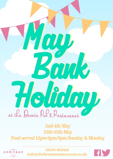
may-bank-holiday-bronte

For my latest client commission I was asked to complete an advetisement for May Bank Holiday events happening at the Heritage Inn Pubs. I was sent a word document containing text information for the posters and was given the brief of a Spring/Summery theme to attract customers to the activities. Once I had created my idea I sent the designs to the PR who forwarded the design to the manager. Once the design was approved I then changed the name of each pub and the contact details so that the posters could be printed and distributed to the pubs across the country.

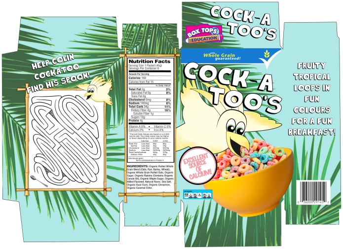
Character and packaging design – final cereal box net

template

Here is my final packaging design for our character and packaging design tutorial on Wednesdays. To finish my box I created my own net by tracing an original packet. I then re-created my character in Illustrator using layers and the pen tool, and I coloured my character to make it look like a cartoon. I then opened photoshop and imported the net and I created a background using palm leaf graphics and a blue background. I imported my character and then various elements that made up the cereal box, such as the bowl of cereal as seen on most cereal packets, and the title and text, as well as the nutritional information and barcodes. I now need to print my box on card and construct it as a mock up to photograph.

This task has taught me a lot about character design and and has also taught me how to use photoshop and Illustrator better. This module has also helped me to improve my computer designing work and the importance of branding to a product.

Character and packaging design – character final

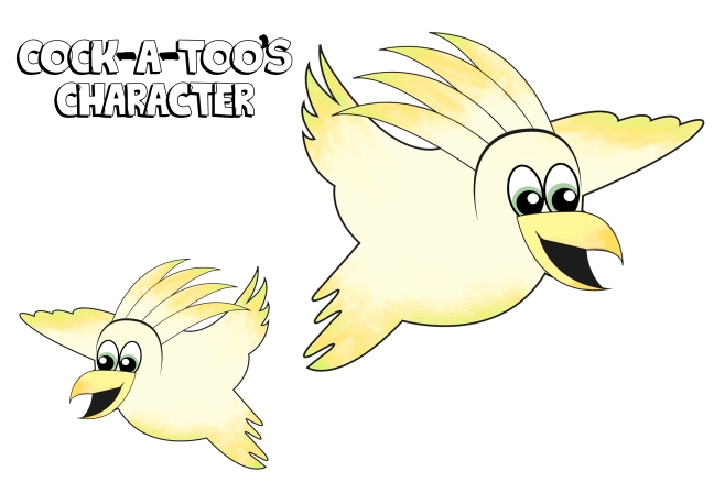
cockatoo

Here I have created my final character for my breakfast cereal. To create my character I used Illustrator; I used the pen tool to trace over my original design and used the fill and paint tools to colour the bird and add gradients at the feathers. I kept the design minimal as I will be adding a lot of elements to my packaging design later. I will now add this to my net to create my final box.

Animation – My final showreel

<p><a href=”https://vimeo.com/123197104″>Final Showreel 2nd Year</a> from <a href=”https://vimeo.com/laurenwinstanley”>Lauren Winstanley</a> on <a href=”https://vimeo.com”>Vimeo</a&gt;.</p>

In my final tutorial for animation I created a showreel which displayed all the animation pieces I have created throughout the year. I found my animation tutorials challenging however I have learnt a lot of skills throughout the year that I didn’t learn in the first  year of study. To create my showreel I used After Effects, and I imported all my videos into the same compilation. I transitioned them together using the presets and text to introduce my different films. I felt I created a successful video to showcase my work which displays my year learning new skills.