In this tutorial we learnt some of the basics of cinema 4d and how to create 3d objects using illustrator files.
We firstly created a number of folders which will contain all of our work. This is so we could keep our working methods separate from our outcomes.

I then opened the E4 logo which I had saved in illustrator from the unilearn page. I made the page full screen and clicked the cross between the two rulers, dragging it to the centre and snapping it to the middle. I then used the ‘artboard’ tool, which allowed me to crop the white negative space down so it fit round the e4 logo. I then saved this file as an ‘Illustrator 8’ file, as this is the latest version which is compatible with cinema4d.
I then opened cinema4d and changed the render settings so that the output was A3, the pixels changed to millimetres , and allowed shadows and changed the action safe to 95%. I saved this as a template.
I then created the scene. I double clicked on the material area to create a mat ball. I clicked & dragged it into the background and floor. I then selected the floor, then tags, then cinema4d tags. Then compositing > compositing background. I then saved this as the scene template.
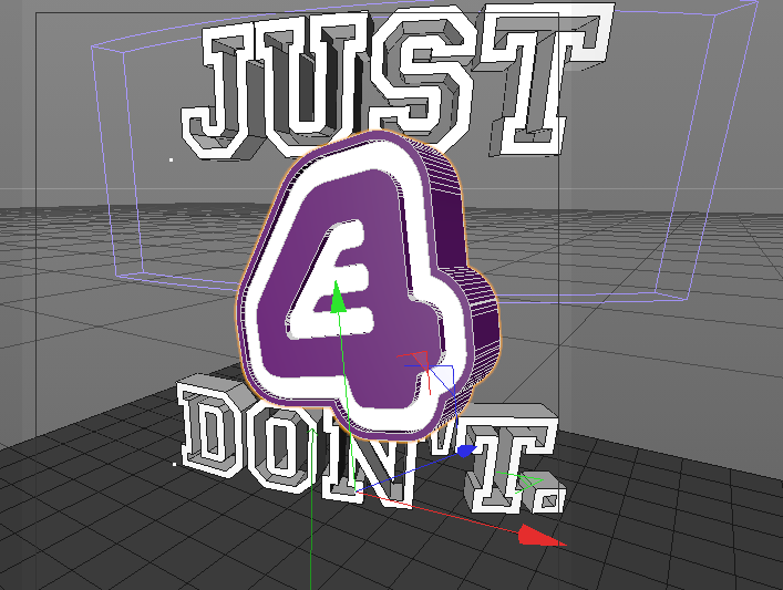
I then wanted to add the logo document. To do this i selected merge > file > then imported the illustrator file. The logo appeared along with the red, green and blue arrows which represented the X, Y and Z dimensions. I dragged on the green arrow until the logo was touching the floor. I then used subdivision > extrude and dragged the e4 logo onto extrude in the layers panel, making sure the arrow was pointing down then I did this. The logo then became 3d. To change the thickness of the 3d I dragged the z axis. To create rounded edges I changed the caps option to ‘fillet cap’, with 3 steps and a radius of 0.5cm.
In the unilearn area there were purple and white versions of the E4 logo. I saved both of these and then merged each with the cinema4d document and merged each with extrudes, naming these both ‘purple’ and ‘white’.
To add colour to my document I clicked in the material area to create a new material. I used the colour picker to change it to white and I unticked luminance in the basic settings to remove the shadow. I dragged this material onto the extrude named ‘white’ to colour the object. I then repeated this with the purple colour, using the RGB settings of R at 110, G at 30 and B at 125. This gave the purple of the e4 logo. I moved this onto the purple extrude. I changed the purple object movement to 150(z) and the white to 120(z). I then moved the white path over the purple path to reveal the colours.


I right clicked on the two extrudes to group them together. The new layer was named ‘null’ even though everything is still in the hierarchy. I changed this to ‘logo’.
My next task was to add text. I selected MoGraph > MoText. I changed the alignment to the middle and changed the text to my logo. I changed the colour by adding a material onto the text and I also got rid of the reflection.
I then added a bend to my text. I created this as a layer and dragged it onto the text layer to activate it. I clicked ‘fit to parent’ to make it surround the text. I manually entered the co ordinates for the R.P at 90 degrees and the R.B at 90 degrees. I went back to the object and again clicked ‘fit to parent’ to change the strength.

I then revealed the logo again and selected the scale tool. I clicked on both areas of the logo to scale the whole thing. I scaled the logo so that it sat between the gap in the text.
I then created a camera and positioned it in front of the logo. The camera would act as a first person point of view. I added lighting to my work and used the red and green arrows to position the light so it was above the image to illuminate it and create shadows. I changed the general settings so there was no illumination. I tinted this light slightly blue.
I then added another light to the right and behind the text, shining onto the other shadow to lessen the harshness of it. I tinted this slightly orange. I added another light which faced behind the text to give the logo a glow, and I changed the background to a darker grey so it could be seen clearer.