
Category Archives: Final Magazine Brief
New Visual Language – Full Research Document
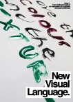
New Visual Language – Final magazine layout


Here is the final layout that I have created for my New Visual Language magazine, starting with a front cover and ending with the back cover. I am really pleased with the outcome of my design; I feel that although it looks simple and ordered, it is clean, fresh and modern. I spent a lot of time placing the text, selecting fonts and arranging pages until I felt that the design was perfect. In addition to my original layout I have also added extra pages which came to be a good idea after I had completed my final layout; I felt I needed to add more to show my final Earth Artifact project. I have tended to stick to minor themes throughout my magazine, which are the use of circles, yellow and black, and the Helvetica font, however I have also tried to keep my magazine pages different from each other to keep the magazine looking interesting.
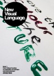
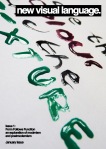
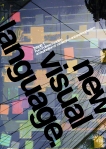
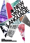
New Visual Language – Final magazine front cover

I have decided to use this cover for the front of my New Visual Language magazine. I chose this one because I like the simplicity and the use of Helvetica within a circular background as the masthead; I feel this simple design adds a lot to the design, whereas others proved to be too simple.
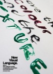
New Visual Language – Final magazine layout

I have used fineliners and graph paper to draw out my final layout for my magazine. The dotted lines represent where the imagery will be, and the filled in spaces represent the titles. The lines represent where the text will be placed.
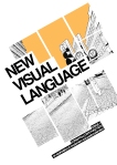
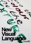
New Visual Language – Developed front covers


I have decided to use this front cover as my final design. I decided to use this front cover because I like the handwritten messy style of the writing, and the range of textures created. To develop this further I have experimented with my different mastheads on this design, to get an idea of which one works best with the image. I have experimented with text orientation, font, borders, opacity and shapes.
New Visual Langage – Contents page designs


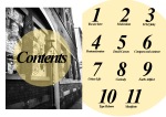


These are my design ideas for the contents page of my magazine. I experimented with a range of media and fonts to create different styles that I think will work for my project. I have used a lot of yellow and black in my designs as I feel these colours work well together and look good on the page. I will now decide which page I want to use to display in my magazine.
New Visual Language – Layout Samples


These are samples of layouts that I will be using to create my magazine. I used existing texts from my research as sample text. I have mainly used the font ‘Helvetica’, as I feel this works for everything and follows a modern and postmodern styles. These aim to give the viewer a feel for what my magazine will look like. I want my magazine to have all different styles, as I feel this will add more interest to the magazine aside from the layouts all being the same. I have tried to follow a modern approach to creating my magazine.
New Visual Language – Resources and projects I will use in my work


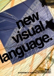
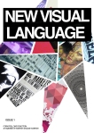
New Visual Language – Front cover designs and variations


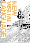


To create these designs I used one of my original designs that I created for the Streetgraphic brief. I experimented with this image by disecting the picture and creating new compilations, to give it a post modern feel. I added text in Helvetica and experimented with moving the text and image around on the page. I like the use of the bold flat colour with the black and white as it makes the page look dynamic, and I also like my use of splitting the image up as this is a bit more interesting to look at than the plain image.
Original image:


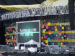
Here I have used Helvetica Text and some images from my photography in the past (the London Eye and some colourful squares, which was a backdrop at a concert I attended). When creating samples for a front cover here, I experimented with layering the images up, as well as adjusting the blending options so that the images merged together and created interesting colours and shapes. I particularly like the simple black design, which shows the wheel outline in different colours, as I feel it is simple yet effective.
Original images:


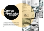
Here I have experimented with different mastheads that I designed earlier, as well as experimenting with an image that I took for my manifesto brief. I liked this image because of the shine effect on the paint. I felt this created a great effect when I applied blending options to the image, as when I layered them up they created abstract yet artistic effects. I like this design as it is fairly simplistic, yet effective and powerful when viewed, as it shows the magazine to be exciting and full of artwork.


To create this design I used my own images from various projects and also my own photography and used sections of them to create a disjointed style mosaic. I then experimented with a simplistic style and the position of my text and image. I like this design as I feel it looks messy but in an artistic way that relates to postmodernism and peoples likeness towards a lack of rules.
Original images:


New Visual Language – Masthead and text experiments


Here I have researched into the creation of my masthead and also what text I will be using in my magazine. I decided to complete pages of ideas so that I could compare each against each other and decide which ones I felt were the most suitable. I will then experiment with these when experimenting with layout to decide the best ideas.
New Visual Language – Initial Layout Research

I have initially experimented with layouts using fine liners and graph paper, to ensure that my designs will be accurate sizes. I have experimented with layouts to get an idea of where text, image and titles will go. The images are presented as the shaded in areas, the background is in white, the title is represented by solid black shapes and the text is represented in lines. This type of thumbnail experimentation will help me when I am experimenting with layout later on in the project when I have figured out designs for my masthead, typeface and images I will use in my work.
New Visual Language – Moodboard of visual research

I decided to create a mood board as part of my research for New Visual Language. I created a mood board to get a better visual idea of previous magazines, from which I could take inspiration. So far, I like the idea of using oversized text and a large use of negative space, as I feel this is more effective than a busy magazine. I also like the colours yellow and orange mixed with simple black and white, as they stand out to the viewer. I may vary my typefaces in my design, as I now feel that sans serifed fonts, when used to a large scale can prove very effective. I will experiment with layouts using this mood board as inspiration.
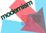
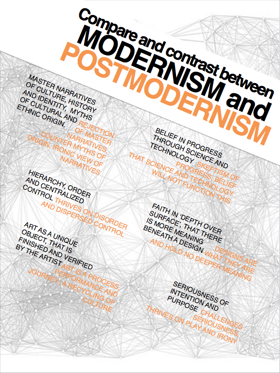
New Visual Language – Comparing and contrasting between modernism and postmodernism

New Visual Language Research – David Carson
David Carson is an American graphic designer, and is best known for his innovative magazine designs and his use of experimental typography. His work is mostly featured in magazine ‘Ray Gun’, in which he demonstrated his well known abstract layout skills. He was a pioneer for the grunge style, and the ‘grunge typography’ era. He is one of the most influential graphic designers of the 1990’s, working for companies such as Quicksilver, Nike, and even Barack Obama’s campaign.
His work is heavily influenced by postmodernist ideas and styles. He abandons all forms of grid systems and columns, headings and even page numbers, which immediately dismisses a modernist view of order and structure. In fact, his work was often barely readable, however this made the viewers focus on his skills as a postmodern designer, rather than a writer. His lack of rules is definitely identified in one issue, in which he uses the font ‘Dingbats’, widely known as involving no letters at all, to add a parodying value to a dull interview with Bryan Ferry. His pioneering grunge design definitely follows laws of postmodernism; the typefaces tend to overlap and break up, which rejects modernist views on order. There is not much that can be said about ‘depth of surface’, the idea of Carson’s design is to simply create nonsense out of serious articles, and therefore all the meaning is seen on the surface. His work follows postmodern ideas of play and irony, as well as challenging the serious of modernism, and this is obvious through his deliberate inability to keep to original articles and just design the page layout; he almost makes a mockery of the idea of interviews or articles by painting over them and even making them unreadable. Carson tells future designers to ‘trust their gut and enjoy working on it, rather than obeying design laws.


New Visual Language – Postmodernism
Postmodernism is a design movement which mainly evolved in the mid 60’s. It is known as a repelling response to the ordered, rational and sterility of modernism, and although modernism appeared to have an abstract feel, there was always that sense of structure. Postmodernism attempts to extinguish these beliefs, saying there is no difference between refined and popular culture. It rejects genders and hierarchies, and embraces complexity, contradiction, ambiguity, diversity and interconnectedness. The idea that there is anything permanent or stable disappears. It doesn’t pretend that art can make meaning or is even meaningful, the values are not moral; they are of creation, self-explanation and surface meaning. Postmodernism likes to just play with nonsense.
Whereas modernism opens up to the idea of ‘grand narratives’ (compelling stories to explain why a certain belief system exists), postmodernism rejects this idea. It rejects historical theories on society, and welcomes the idea of the inaccurate, as well as being sceptical about progress and the idea that technology will transform society. It challenges seriousness and embraces sarcasm and irony, as well as being bold about sexuality and sexual activity. There is a loss of centralized control and a loss of order; it thrives on the disjointed style. It draws attention to surface rather than depth, explaining that things are as they are rather than getting into any deep meaning. Postmodernism thrives upon a lack of rules, and in the likes of design, a design doesn’t have to be perfect for it to be artistic. Art is seen as a process and a performance, rather than a finish piece by an artist, relating to specific standards. The interconnectedness becomes central in a postmodern society, and this interconnectedness comes with the technology and communications of the 21st century. The focus has shifted from security in a given truth of modernism, to searching for significance in a chaotic world.


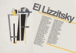
New Visual Language Research – El Lizzitsky
El Lizzitsky is a Russian artist and designer who was a heavy influence on modernism, through movements like cubism and constructivism, and his work heavily influenced the iconic Bauhaus company. His Russian style was influenced, and used, by the Soviet Union. He believed, like the modernist viewpoint, that the artist could be an agent for change, which he later summarized as ‘goal orientated creation’. He was heavily influenced by his study as an architect, and was most known for creating pieces called ‘Prouns’, which were abstract pictures that he described to be ‘the interchange station between art and architecture’.
His style definitely follows a modernist movement as it favours abstraction, and it rejects any historical or religious reference or meaning. It is self-centered, and achieves itself through individualism. The forms of the shapes are very sharp; we can tell what sort of shapes have made up the image, and most of the designs seem to follow a particular direction; all shapes are usually aligned equally along one diagonal. The design also has particular depth over meaning; Lizzitsky tells us his ‘Proun’ collection relates to architecture, and this sense of meaning is something modernism follows. The designs are restricted in typeface as the designs including type use Russian-style fonts, and they are also restricted in colours, as each piece has a specific colour scheme only ranging from two or three colours.


New Visual Language – Timeline of design movements

New Visual Language – Modernism
Modernism in art and design emerged during the aftermath of the First World War and during the Russian Revolution. The 19th Century was a world full of order and stability, which, could not keep up with a world full of futility and anarchy. The pioneers of the movement dreamed of a world free of conflict, greed and inequality. It was more of a collection of ideas rather than a style; many styles can hold a modernist characteristic, but the main ideas are that they reject historical reference, have a preference for abstraction, and a belief that society could be transformed by design and technology.
Modernism believed in myths of our cultural and ethnic origins, and also welcomed the idea of ‘Grand Theory’, which believes explanations through science, history and culture can explain everything. Although it had faith in social and cultural unity, it also believed in hierarchies of social class and ethnic/national values as a basis for unity. It found truth in progress through science and technology and that these would build a better future for the world. Modernism was a self-centred collection; it achieved itself through individualism, and unified identity. It took the idea of ‘the nuclear family’ as a central unit of social order and a model of the middle class. It took faith in big politics, the ‘real’ beyond media and mass culture, consumption and marketing. It believed in the idea of ‘depth over surface’, which is believing pieces to have further meaning, value and content as to what is immediately seen by the viewer. It was serious about intention and purpose, attempting to embrace totality, and the clear difference between human and inhuman. It was highly censored in sexual reference, and held a sense of clear generic boundaries and wholeness, immediately found in art but also found within music and literature.


New Visual Language – Synopsis of the brief
For our final project in our first year, we have been instructed to submit a Graphic design magazine, entitled ‘New Visual Language’. We must treat the magazine as if it will have lots of Issues; issue one focusing on Form Follows Function – an exploration of modernism and post modernism. The magazine must be published on Issuu.
To build up our magazine, we must research modernism and post-modernism. We must explore the origins and history of each of the movements, as well as expressing these styles visually through our work. In support of these movements, we must understand the social, industrial and political concerns, and we must also conduct valid artist research, which could be presented as features in the publications. Most importantly, we must also compare and contrast modernism and post-modernism to identify what has changed and how they differ from each other.
The publication will also be built up using our resources that we have created in our three design briefs, our typography brief and possibly the manifesto brief, which will be edited versions and not the whole project, to showcase all the work we have completed this year. The magazine must include a sturdy masthead, a cover design, a contents page and a reasonable amount of inner pages. The size of the publication must be A3. We must include evidence of thumbnail visuals and design layouts, and evidence of grid, layout, type and image selection and experimentation. We must also include evidence of multiple design solutions.
