17th February 2014 – Premiere Tutorials – Adding a series of clips and effects

In this tutorial we learnt how to add a series of frames to the same timeline and add basic effects.

Image

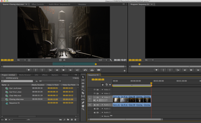
To add different clips together I added my files to Premiere. I chose one and dragged it to the source screen. I then used the timeline pointer to drag to a part in the video that I wanted to include. I pressed the ‘i’ key to start the time in which I wanted to include. I then moved the cursor so that ten seconds of film was played and I pressed the ‘O’ key to cut this section. I then pressed the ‘,’ key to add this to the sequence. I repeated this five times to create a small movie.

Image

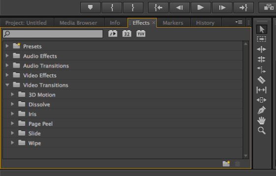
I then wanted to add effects to my video. The effects can be found under the 4th tab along for the project. To add an effect to my sequence I would select the desired effect and click and drag it onto the sequence. I can drag effects onto each scene to change the visual aspects, or I could drag effects in between scenes to create interesting transitions.


Image


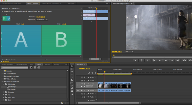
Here I experimented with the Cube Spin transition effect to change scenes. When using the cube spin I can adjust the time and speed of the cube spin.


Image


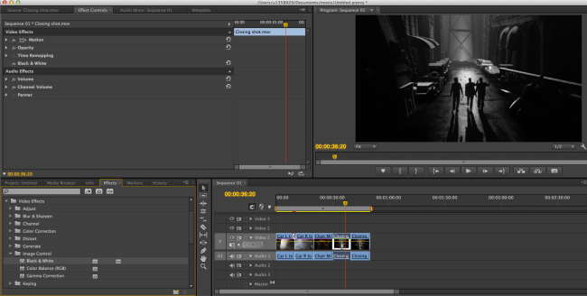
Here I experimented with making the movie turn from a colour video to a black and white video, using the black and white setting in video effects. Using black and white can instantly make a move look old, or as if a scene was to be filmed in the past.


Image


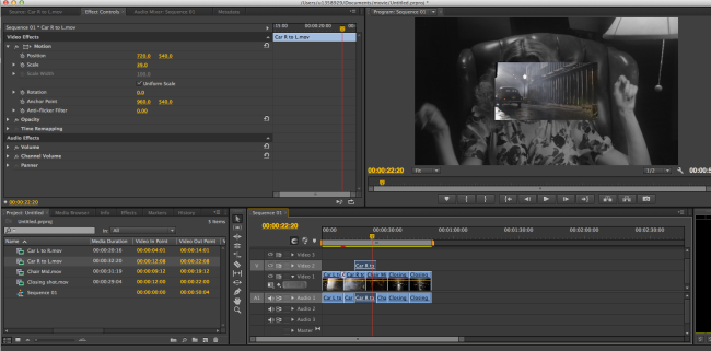
Here I have shown how I imported two scenes on top of each other, so that another window can be shown in the video.

Image


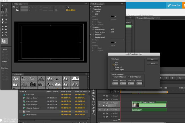
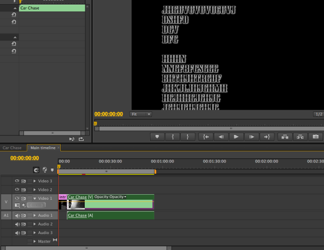
I also learnt how to create a roll of credits on a video. This involved using the text tool to create random text and choose an appropriate font for the film. I then adjusted the text movement options so that the text rolled up from the bottom of the screen. it could also be decided if the text should start off the screen.

Image

Design Practice 1 – Illustrator Tutorials – Creating a halftone effect

Image

Image

Image

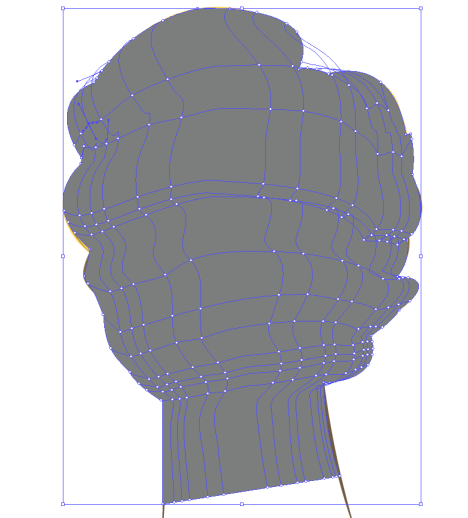
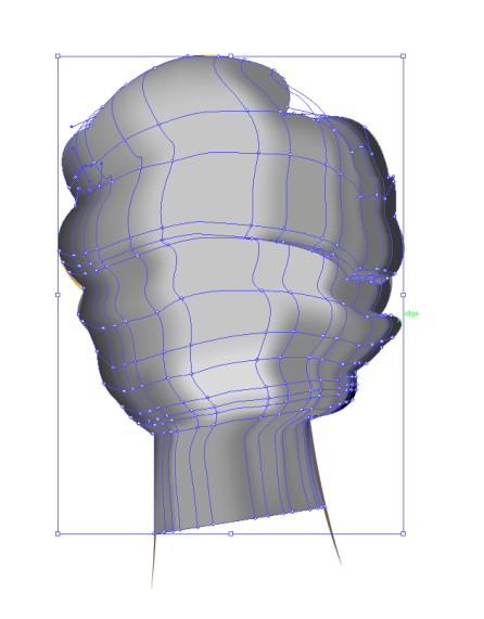
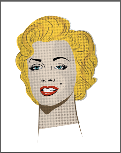
Here I have included screenshots of my creation of a half tone effect in illustrator. To create the half tone pattern I firstly used the pen tool to draw a grey shape over the top of the image. I then created a gradient mesh by using the gradient mesh tool. Once I had used this tool I then added various points in the tool, more points in the darker areas and less in the lighter areas. I then used the fill tool to colour the darker and the lighter areas (second picture). I then went to Effects>pixxelate>colour halftone to create the halftone dot effect (third image).

First attempt at creating my full typeface-design practice 2

20140224-192126.jpg

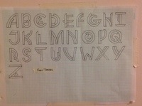
This is my first attempt at creating a full typeface using my letter experiments. I used a3 graph paper, a pencil, fineliner and a pair of compasses to construct my designs. I took my most preferred letter from each of my developments and defined the shape and size to fit in with eachother. I am proud with how my design has worked however I feel I need to improve on making the letters the same width and the bars the same width.

Developed Typography – Design Practice 2


These are my developed typeface letters for my typography project. I took inspiration from my first set of samples which were inspired by Herbert Bayer. I developed each letter three times to try out different looks and styles which would make my full typeface. I used a pencil, fineliner and a pair of compasses to create the curves and styles in my letters. I like these designs and I will be using them to create a full font typeface.

2nd typography samples – Design Practice 2

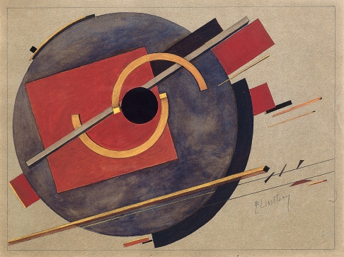
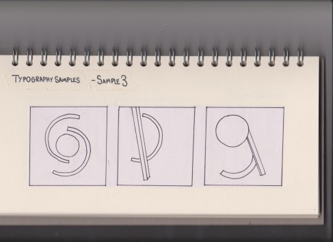
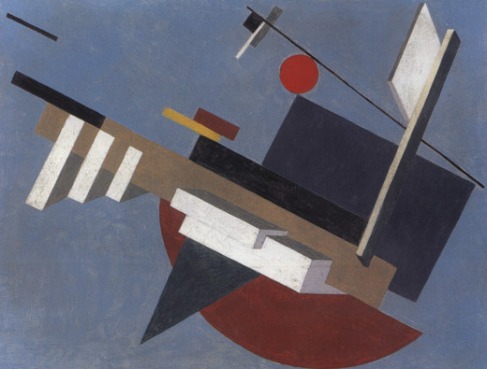
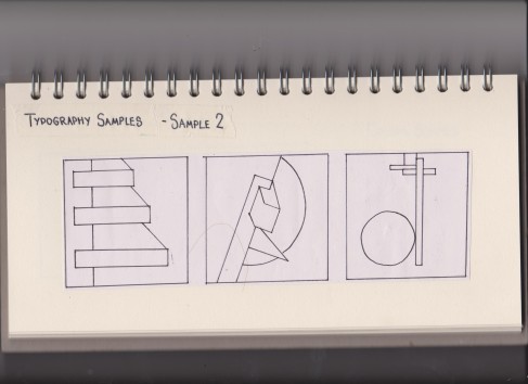
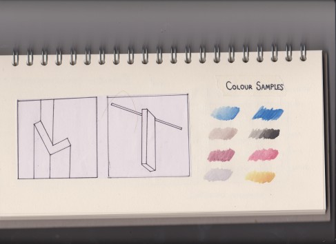
These typography samples were inspired by ‘PROUN’ by El Lizzitsky (1923). This image proved harder for me when discovering letters however I liked the amount of shapes that this image have to offer. There are a lot of angles and a range of straights and curves to create fonts. I created five samples and a colour scheme of the picture. 

Image


Image

Image

Typography Inspiration 1 – design practice 2

For this task I had to select three geometrical art pieces from a large selection and create typefaces inspired by these three pieces. 

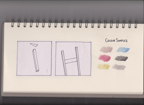
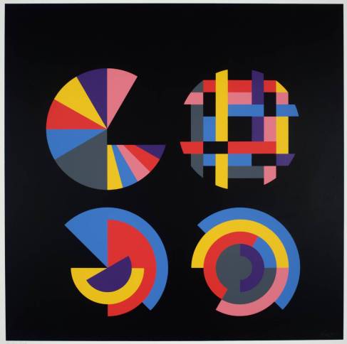
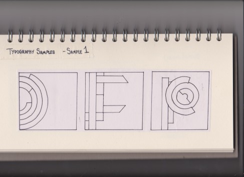
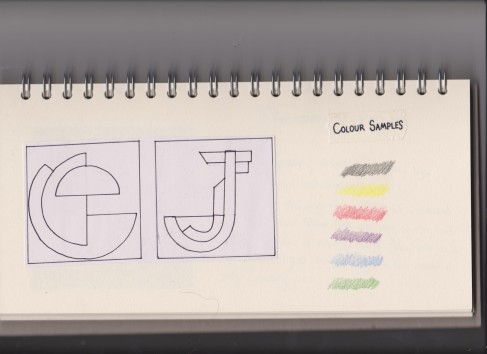
My first typography samples were inspired by this piece called ‘Four Segmented Circles’ by Herbert Bayer. This image was very interesting as it allowed me to discover letters that are very circular and made up of lots of strips of colour. They look almost mechanical and when put together can create a very interesting font. To experiment with this image I created five sample letters and completed a colour sample. 

Image


Image

Image

17th February – Cinema 4D tutorials – working with shapes

In this tutorial I learnt how to manipulate shapes and how shapes work/can be created in cinema 4d.

Image

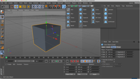
To add basic shapes to the page I clicked the ‘cube’ object. Clicking the cube object once created a cube on the page. However holding down the cube button allowed me to select a range of basic shapes that could be added to the page. 

Image

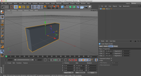
The yellow dots that can be seen on the axis that overlaps the shape can be altered to change the form of the shape. If the dots are simply clicked and dragged then the shapes dimensions can are altered, resulting in a different style of shape. 

Image

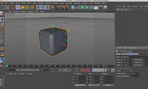
The next tool I experimented with is the fillet tool. The fillet tool is a small checkbox in the bottom right hand corner, which when checked created rounded edges to my shape. The properties can be adjusted to determine the size and hardness of the curves. The fillet tool makes objects look a lot softer. 

Image

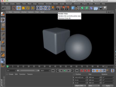
To show a more realistic idea of what the graphic looks like, we can use render view. Render view is located in the top control bar and can be toggled on by just clicking it. It displays accurate shading and shadow of the shapes and allows us to get a better view of what the shape looks like. 

Image

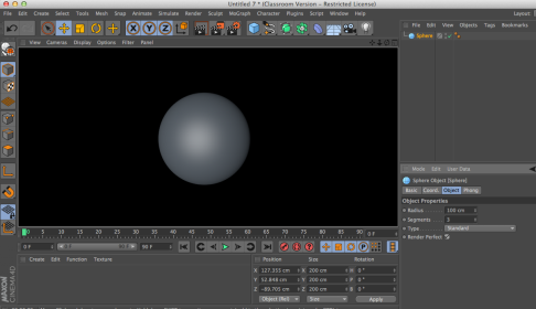
As well as adjusting the radius we can also adjust the phong angle. The phong angle determines how much shading and blending the shape has. A higher number in the phong angle works better for a sphere as it will have a smoother shadow, however for a polygon such as the one displayed, the angles are much sharper therefore there will be less blend. Decreasing the phong angle will allow harsher shadow. 

Image

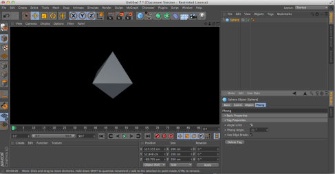
As well as the phong we can also used the ‘render perfect’ too. Render perfect determines how the shape will be rendered in render view. If the tick box is checked, then, for example, a sphere will always be rendered as a perfect sphere. However if the box is unchecked then the sphere will be rendered however it looks normally, taking into account the radius and amount of segments. 

Design In Context 1 – Manifestos – Visual summery of secondary research

Image


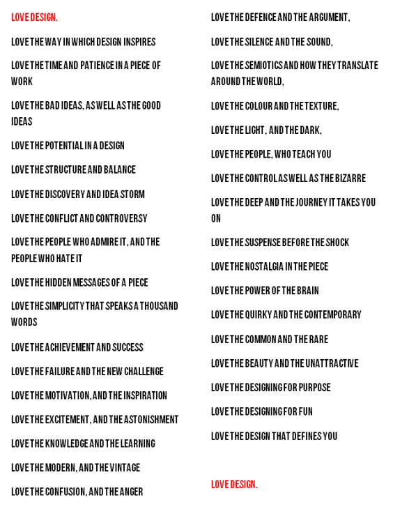
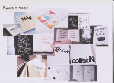
This is a portfolio of secondary research that I have completed for my manifesto. I have completed this research for the visuals of my manifesto, ie, what it will look like when it is down on paper. I have decided to create my manifesto in a very visual way. I want to create a typographical book, with a sentence of my manifesto on each page as I feel this will be more visually interesting than if my manifesto was just written down normally. 

Design Practice 1 – Earth Artifact – Art pieces I have created for my project

Image


Image


Image


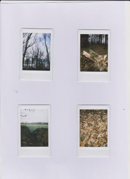
These are pieces I have created as part of my Earth Artifact project, that I may include in my final design. The first I created using my Instax Polaroid camera when taking pictures of nature.

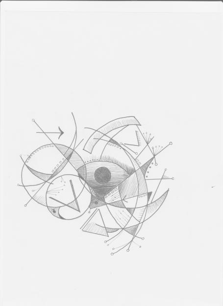
The second piece I created when studying mathmatical symbolism, and I thought it would be creative to use them in creating a grahical and eyecatching piece. I used fineliner pens varying in thickness to draw this. 

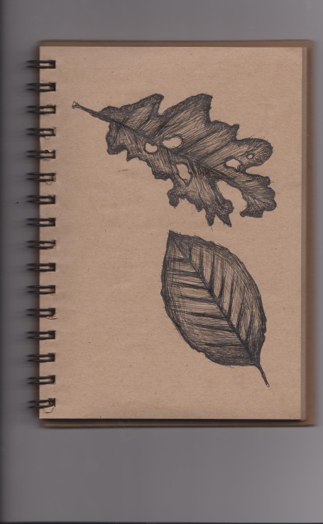
The third piece I created using leaves I found when taking pictures. I think that leaves describe nature of the world very well, as it shows both the grow and decay, which is what the worlds spieces do. To draw the leaves I used a brown-papered notebook and fineliner pens. I used a crosshatching technique to create shading. 

Design Practice 1 – Earth Artifact – Road Map

Image

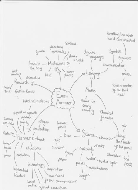
Here is my road map for the Earth Artifact brief. Here I have noted down the main themes that exist on the planets and various themes that I should be considering for my project. Through my road map I have also shown how different themes link throughout the world, and how much humans have influenced the production and beneficial factors of our lives today.

12 Principles of Animation – Arcs

As part of the 12 principles of animation we looked at one of the rules which was creating arcs. The majority of actions follow an arc of some point, as this is true to human and animal movement. Arcs give animation a more natural action and better flow, and all movement is executed on arcs.
To create my example here I created a circle and a basic animation to move it across the screen. I then copied this and moved it underneath. I created a key in the middle of my copies timeline and moved the timeline back to the start. I then used the anchor points to move the direction of the path up and then back down again. When playing the two dots together you can see the curve in the bottom one as opposed to the straight of the top one.