Huddersfield Rebrand – Final Designs and mock ups

Using the brand guidelines I created for the cotton factory, I followed the rules to create my own designs to support the club. I used illustrator to create the original designs and then I used photoshop to create realistically-styled mock-ups for each element I created, including a sample Facebook and twitter pages. I also used a sample background for the brown paper to attempt at the full illusion of the real designs.

Huddersfield Rebrand – Brand Guidelines

For the Huddersfield Rebrand Project we were instructed to create a full set of brand guidelines which outlined the specific rules for designing for The Cotton Factory. The guidelines must cover all aspects of the designs, including image use, materials, typography and correct wording. I also had to display ways in which the elements could be designed incorrectly as this provides further guidance for designers and allows little room for error. It was also required to provide correct measurements and an evaluation of the aims of the company so the theme and ethos could be captured correctly.

Huddersfield Rebrand – Introduction to the Brief

For the next 5 weeks we have been given the rebranding brief; in which we will revive a potentially dying business in Huddersfield. Branding is key in marketing as it is how companies make a popular and well known name, as well as being able to sell their produce.

We must select a company whilst walking round Huddersfield that we feel could do with a complete rebrand. Once we have chosen our company we must then conduct research into the company, the competition and the target market, and also research branding opportunities and outcomes.

We will create 3-5 outcomes for our company which relate to the genre, which we will present within our project and attempt to make. I am excited to start this project as branding is something that I definitely want to persue in the future and I also feel that it could benefit the company.

e663b3bf72634481cb7468dbab506fbb f9b873f8870b2b0a5d206e40a74e697a fc28b2ca840d4872009ac85868569ebf

A Conversation – Photograph development for magazine

43 and 44

I have taken some photographs which I want to use in my magazine. I took pictures of my stack of letters and also the letters in various places. I wanted to use pictures of the scenery around me as I love photography and it is something that I am strong at, therefore it is something I want to do for my final project. I then edited my photographs in photoshop. I now plan to use these in my magazine pages.

A Conversation – ‘Text Speak’

text1 text2 text3

I decided to compare the differences between communication in the past and the present in a different way; studying ‘text speak’. I transcribed one of the original letters into text speak. When I did this I noticed that the texts were more simplified and shorter than the letters, and I used the classic texting way of speaking (2morro, 4ever, @, etx..). This shows how communication has vastly changed over time, from formal, written and detailed to short, to the point and through network or internet programmes.

A Conversation – ‘Don’t speak…’

31 and 32blogpost

My idea for this photoshoot was to convey conversations when people are told something without verbal action. I I thought a lot about semiotics and how many of the symbols we see today were invented to convey instruction to people of all languages, with the idea of being able to give direction without literal dialect. However mundane the object may be, it still conveys a message that affects what a person does on a daily basis.These are not always literal signs; they include gestures and suggestion from various objects. The power of silence through communication can sometimes be just as important as the verbal aspect.

A Conversation – A Distortion

distorted letter

AI combined my translations of the letters to create an unusual typographic piece that I feel looks visually interesting. Not only does it display distortion of lettering and messages but it also defines my point of trying to read something that was meant to be read that cannot be interpreted. Through this we can descover the importance of typography towards portraying a message. I have also tried to convey the distortion of networks and how they cause problems when sending texts.

A Conversation – The Letter – Subsidising a phone for a letter

scan017

My phone travels around with me all day long, in my bag, pocket and resting on my desk. Distorting this idea, I wondered what it would be like if I carried a letter around with me all day. I carried it in my bag, stuffed it in my pocket and rested it on the desk in class and in lectures.

I carried the letter in both my bag and my pocket on a particularly windy and rainy day. As shown the letter became crumpled and stained after exposure to the weather and the words also smudged. I also managed to spill coffee on the letter. Within this task I attempted to show the digital distortion through physical distortion; conversations can easily be misinterpreted in the digital world. Network errors result in a loss of communication, just as much as a letter that needs to be read cannot be read.

Work Inspired By…Anthony Burrill

In further research to the work of Anthony Burrill I decided to have a go at creating my own interpretations of his work. I used two different fonts and made sure that they were a vintage headline style, as displayed in his work. Although this task may look easy I actually found it quite challenging; I took a lot of time in the placement of the text and trying to get the text all central to one another, as well as deciding on the correct text size and the ratio between used space and negative space that I wanted to balance well. I also spent a lot of time on picking the colours; not too bold so that it doesn’t pull attention from the text and also so the text is readable, so I chose more pastel colours. I feel that this is a good form of art communication as it translates messages that almost shout out at the viewer and force the viewer to read the message due to the simplistic nature of the artwork.

I am interested in…Anthony Burrill

Antony Burrill is a designer known for his bold, persuasive and motivational communication typography. Words and output are an important factor of his work. His words ‘Work Hard and be nice to people’ has become a common mantra for designers worldwide. His work focuses on light touches of humour, with the bold text set on block colour allowing the messages to stick in the viewers’ minds, an example of simplicity having a greater effect than complexity. His work reaches out to people in a humouring rhetorical sense, communicating with them to make them decide on a personal answer. Viewers will converse with themselves in a positive way to make better life and design choices. I like Burrill’s work because although simple it is very eye catching and I feel it emotes great effect. I also like the block print effect.

A Conversation – Transcribing my letter into different languages and symbols

I wanted to see how letters looked when they were transcribed into different languages and symbols. Once I had transcribed one of my letters from the past, I changed the text and translated, to discover and display the different ways in which different communities and societies communicate. They range from the practical languages of Spanish and Japanese to the more unusual, like Wingdings and braille. This has pulled a letter that was written in 1949 into the 21st Century of modern day type and translation.

I am interested in…Sophie Calle (A Conversation)

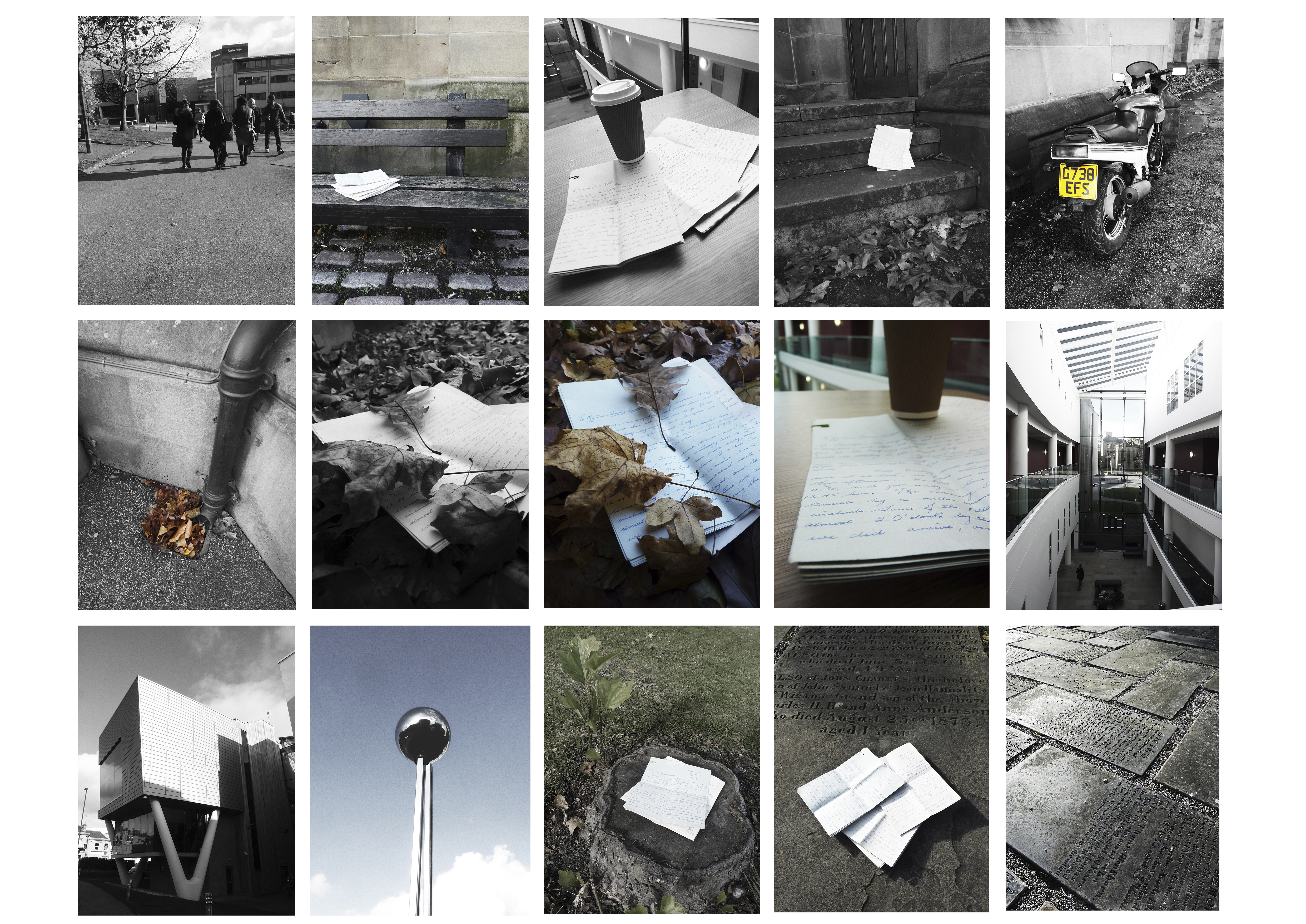
Sophie Calle is a first-person French artist, in her works she directs herself shamelessly and unreservedly, recounting stories she has lived with a definite concern for detail. She turns the people around her, whether she knows them or not into important values in her work. Her work is simple in idea and often invading of privacy, however she uses this crude uproar to her artistic advantage. Calle’s style interests me greatly; I view her work as a way in which she converses with herself and compensates for loneliness, however as a reverse or a distortion, she gets to know people without ever speaking with them; she just likes to experience how different people react to her works.

Suite Venitienne

‘I followed strangers on the street. For the pleasure of following them, not because they particularly interested me.’Sophie intended to get to know people without talking to them, taking a distorted perspective on a conversation.

The Sleepers

‘I asked people to give me a few hours of their sleep. To come and sleep in my bed. To let themselves be looked at and photographed. To answer questions. To each participant I suggested an 8 hour stay.’ Although this suggests a stalkative attitude, There is definition within a conversation; rather than interacting with someone who is awake, she interacts with someone sleeping.

The Blind

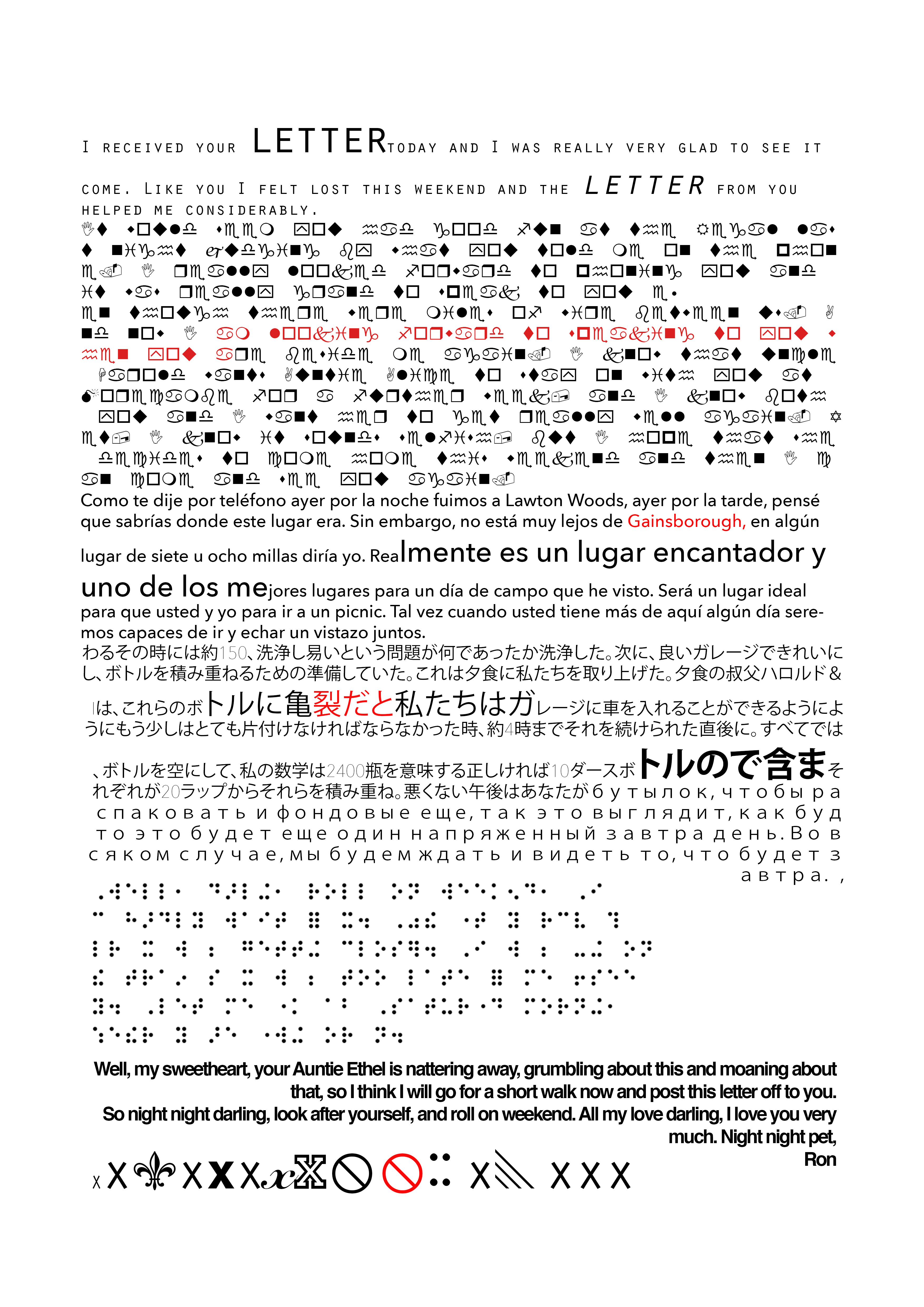
‘I met people who were born blind. Who had never seen. I asked them what their image of beauty was.’ This is a harsh distortion which can describe how people often have conversations with themselves; we are shown how people imagine things and how much sound, touch and smell are just as important in a conversation as much as speech and sight.

Sophie Calle’s work has influenced some of my research for ‘a conversation’, as I found her work as an artist interesting and something I wanted to try for myself.

A Conversation – Something that was meant to be read that cannot be read

11 and 12

13 and 14

As part of this mornings seminar we discussed the use of concept challenge, and how dominant ideas can be changed in simple ways to generate new ideas. Therefore, with original strong ideas we can reverse, exaggerate, distort and wishful think to look at our ideas at new angles. With this in mind I used the letters that belonged to my nanna and distorted them, creating the concept as something that is meant to be read that cannot be read. This kind of thinking has helped me generate many ideas that will help me to create a substantial project.

A Conversation – Letters through the years

I recently came across an interesting document of conversation; over 50 individual letters from my grandad to my nanna written from 1949-1950. This is an interesting insight into the ways in which we used to communicate without the modern technology we know today, Not only does it contain a more formal way of speech to what we are used to now, but it displays the legibility of people back then and how writing styles have changed.