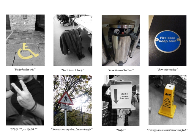
My idea for this photoshoot was to convey conversations when people are told something without verbal action. I I thought a lot about semiotics and how many of the symbols we see today were invented to convey instruction to people of all languages, with the idea of being able to give direction without literal dialect. However mundane the object may be, it still conveys a message that affects what a person does on a daily basis.These are not always literal signs; they include gestures and suggestion from various objects. The power of silence through communication can sometimes be just as important as the verbal aspect.
Monthly Archives: October 2014
A Conversation – A Distortion
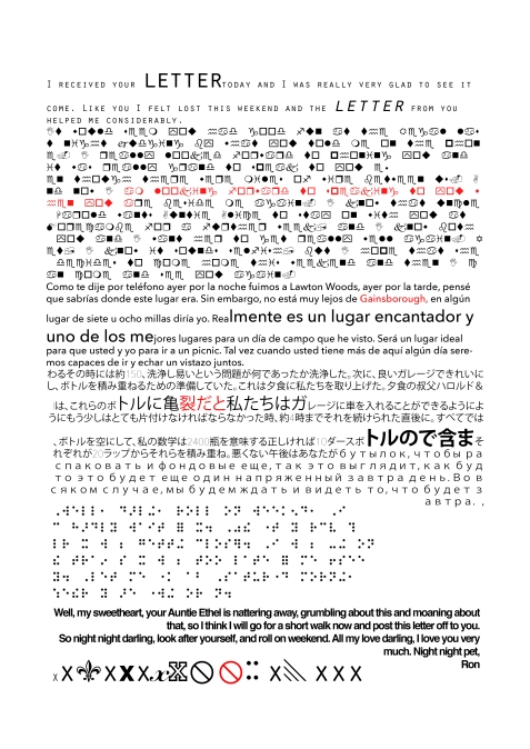
AI combined my translations of the letters to create an unusual typographic piece that I feel looks visually interesting. Not only does it display distortion of lettering and messages but it also defines my point of trying to read something that was meant to be read that cannot be interpreted. Through this we can descover the importance of typography towards portraying a message. I have also tried to convey the distortion of networks and how they cause problems when sending texts.
A Conversation – The Letter – Subsidising a phone for a letter
My phone travels around with me all day long, in my bag, pocket and resting on my desk. Distorting this idea, I wondered what it would be like if I carried a letter around with me all day. I carried it in my bag, stuffed it in my pocket and rested it on the desk in class and in lectures.
I carried the letter in both my bag and my pocket on a particularly windy and rainy day. As shown the letter became crumpled and stained after exposure to the weather and the words also smudged. I also managed to spill coffee on the letter. Within this task I attempted to show the digital distortion through physical distortion; conversations can easily be misinterpreted in the digital world. Network errors result in a loss of communication, just as much as a letter that needs to be read cannot be read.
27th October – Can Art Be Taught? (James Elkins)
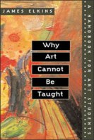
In this lecture we studied the theorist opinions of artist and historian James Elkins who wrote the book ‘Why Art Cannot Be Taught’. He sees art understanding as the most important understanding, and writes provocative and skeptical texts which describe art teaching as completely irrational. He believes that art is taught in a studio not in a university, concluding that when involved in art teaching, you shouldn’t look for a rational dialogue.
The book ‘Why Art Cannot Be Taught’ , is seen as a manual for students, and includes the recording of critiques, showing the intersection of theory and practice and thus describing how theory does take a role in design practice.
Elkins emphasises on a number of problems, mainly to do with the uncontrolling teachings of the Bauhaus. Pre-bauhaus academies were not experimental like the Bauhaus; early art education focused on ,mathematical approaches, geometry and proportion, and were uninterested in the abstract values. He idealises a golden age of art, scouring art history for styles and combining these styles to formulate new art, having an emphasis on knowing contemporary history.
His problems also lay with the idea of perfect pre portion and decorum. There was no distortion, no emphasis and no originality. Art was all the same, which opens no doors to originality and learning further. he believes that everything material is formed; we do not operate with platonic form theory, and grace is no longer expressive. Elkins sees these structured results as the fault of ‘too much theory’.
After the Bauhaus, Elkins focuses on the overlap between disciplines. He believes that teaching is based on conversations. The student/tutor are involved in hazy discussions that rarely reaches a conclusion, however from this we learn and communicate new ways of thinking. The fact that we do not come to terms with fundamental difficulties and acknowledge complex issues creates contagious creative sparks, that we catch off one another.
Researching more interesting ways to create a CV
When sending out my Cv to possible design companies that I will be working for I want them to remember me so I can be considered for experience. Here I have researched a view interesting ways in which my CV can stand out that I will take inspiration from. CV design doesn’t have to be boring; it is a personal look at what you can do, therefore it is your right to make it look however you want to put across your assets as a designer. Companies will immediately look at designs that pop out from the pile of boring texts and paragraphs. Over the next few weeks I will have a go at designing my own CV prototypes and determine which design would take me further.
Work Inspired By…Anthony Burrill
In further research to the work of Anthony Burrill I decided to have a go at creating my own interpretations of his work. I used two different fonts and made sure that they were a vintage headline style, as displayed in his work. Although this task may look easy I actually found it quite challenging; I took a lot of time in the placement of the text and trying to get the text all central to one another, as well as deciding on the correct text size and the ratio between used space and negative space that I wanted to balance well. I also spent a lot of time on picking the colours; not too bold so that it doesn’t pull attention from the text and also so the text is readable, so I chose more pastel colours. I feel that this is a good form of art communication as it translates messages that almost shout out at the viewer and force the viewer to read the message due to the simplistic nature of the artwork.
Project 2060 – Imaginary Projects that a designer may engage with in my future world
For our next task we were asked to consider projects which we may have to undertake in 2060, abiding towards the changes of the world and listing the skills, understanding and anything needed for the designer to successfully operate.
I imagine the future world to be struggling with population growth and therefore problems with resources. It is something that is reminiscent of the World Wars where food was rationed, and this is causing conflict between societies.
Here are some possible scenarios that designers may have to consider to tackle/deal with this problem:
Promotion of food rationing
Designers may have to consider making the food rationing system look more appealing to the population as it will be a growing problem. There may be ways in which they have to promote users to grow their own crops in order to survive.
The building of controlled farming areas
Designers may have to take an architectural route in the future by designing future buildings and areas to control self grown farming. The areas would be controlled for the best growing conditions to fight against the changes in weather, as global warming and deforestation may cause problems with oxygen and bad weather. Designers could design the building and how it functions, as well as promotional material for the process and also job advertisements.
Anti – war propaganda
The loss of food may cause fighting among populations and eventually break out in war, therefore designers could help create promotional materials to stop fighting and consider the needs of others. Encouraging people to help out and control their food intake could be really helpful towards the development of modern society.
Project 2060 – Future issues and it’s effect on the future designers
Forming new groups, we were given the task of imagining the world in 2060. Based on the average age of the group and the current regulations, this is approximately the date when we would be eligible for retirement and a state pension. We were instructed to think about the impact the world would have on various problems and how we could overcome it, or even be defeated by it:
Environmental Issues:
The world is already facing problems with global warming and deforestation, which has rapidly increase over the past 20 years due to new technology using up more carbon emissions. By 2060, oxygen may be at a lower level due to the reduction of green plants, which could risk our quality and quantity of life. The increase in temperature could also result in plants dying out and certain environments becoming unsuitable for some animals/humans, and it is unknown what small difference could impact the world in a big way.
This change could impact future designer work because of the problem of deforestation; trees are needed for paper however trees are more importantly needed for oxygen. Designers will have to resort to alternative methods such as using electronic designs or limiting designs to only being produced digitally.
Peak Oil (Reduction of oil stocks and rising prices)
Oil is already considered expensive as we use it so widely across the world. The increase in consumers buying automobiles has also rapidly decreased the amount of oil, therefore alternate methods are trying to be devised to get round this. By 2060, oil may have run out completely or in very short supply. This will effect travel and people may have to resort to electronic alternatives, like electric cars. Plastic is made from oil and is widely used across the world, therefore we may have to adapt to eco friendly methods, like decomposing packaging.
This could affect design work for designers as they will have to consider eco friendly design more. With oil at risk, plastic may have to be used sparingly, so a design threat would be designing without the use of wasteful materials.
Population Growth (effect on resources etc)
With the earth’s population growing all the time, this is having an effect on the resources of the Earth; they are rapidly decreasing and by 2060 supplies may be short or completely wiped out, which can also be affected by the reduction in oil and the environmental issues. We may have to survive on renewable sources and growing our own food.
This will affect designers as resources may be few and far between to design with, including digital equipment, and we must consider ways in which design could be as minimal as possible.
War and Political Instability
War is common in this day and age and there is no telling what conflicts will have risen by the time we reach 2060. Humans could continue to disagree, forming more wars and rivalries between countries than what is happening already, increasing the violence and lack of safety in societies. This could also heavily divide the world into rivalries that cannot be stopped. On the other hand, war may have also been abolished and the Earth may be a more cooperative place.
This could affect design as designers may be under pressure to create without upsetting other groups of people which causes more problems. However design may become easier if different groups get along with each other.
Disease
Disease is something that will either be abolished or made worse. With increasing medical technology and funding, hospitals and scientific development may have found ways to overcome unfortunate diseases, such as cancer, making life last longer. On the other hand, the increase in toxic carbon emissions and global warming could increase the severity of bad illnesses, and with population increase, hospitals may struggle to cater for all patients.
Design may be affected as designers will be commissioned to raise awareness about illness spreading. If more hospitals are needed, then designers will need to design the hospitals, including various treatment rooms and facilities.
Job Advertisements – Reviews, Discussions and Interests
In groups we looked at various job boards on the internet which specialized in advertising graphic design related jobs. There are many websites to visit if you are looking for a design career, such as:
Itsnicethat.com
jobs.designweek.co.uk
creativereview.co.uk
designjobsboard.com
creativepool.com
In groups we looked at these job board sites and analysed them for their uses, the most interesting and useful jobs, skills and knowledge needed for industry and also what we need to develop further during our time at university.
Interesting and potentially useful factors regarding the job adverts available
When looking for jobs we found that on the design websites, the jobs were divided into categories, therefore we could search for the exact job we wanted. This saves us from applying to a job accidentally that we don’t really want to do, or submitting your CV to the wrong style of company. We also found their to be a large range of jobs available; some were generally graphic design, however others focused on one particular aspect, like advertising, events design and even design marketing. This is good as we can define our choices further. What is also useful is information on location and salary as these are important for justifying the living opportunities whilst on placement. Each job advertisement also provides a full explanation of the job, including hours and skills included, as well as what you will gain skills on whilst working for the company.
What jobs could we go on to achieve once we have our degree?
- Advertising art director
- Animator
- Graphic designer
- Illustrator
- Printmaker
- Production designer, theatre/television/film
- Exhibition designer
- Fine artist
- Interior and spatial designer
- Medical illustrator
- Multimedia specialist
- Photographer
- Events Design
- Design Marketing
- Branding Design
- Design Director
Skills, knowledge and competencies we need to know when presenting our CV to potential companies:
- Knowledge of the companies recent projects
- skills in Adobe Suites, especially Photoshop, Illustrator, After Effects and InDesign so you can do the work they require of you
- A passion for your work
- A clear, precise and professional looking CV to show you’d like to take the job seriously
- Confidence and a good and memorable attitude so employers remember you; do not be arrogant or cocky.
- Knowledge of design techniques both manually and technologically.
- A positive attitude towards your future.
Skills, competencies and knowledge we need to develop further during our remaining time at university:
- Thorough techniques when using the Adobe suite and other vital programs
- Having confidence within our work, whether we are proud of it or not
- Reasoning behind our projects
- Including as much initial and development work as well as our final ideas – employers like to see how we got to where we are
- Time management and meeting deadlines
- Good knowledge of design theory as well as practice so we can support reasoning for our work
- Be honest about work and distinguish the good from the bad
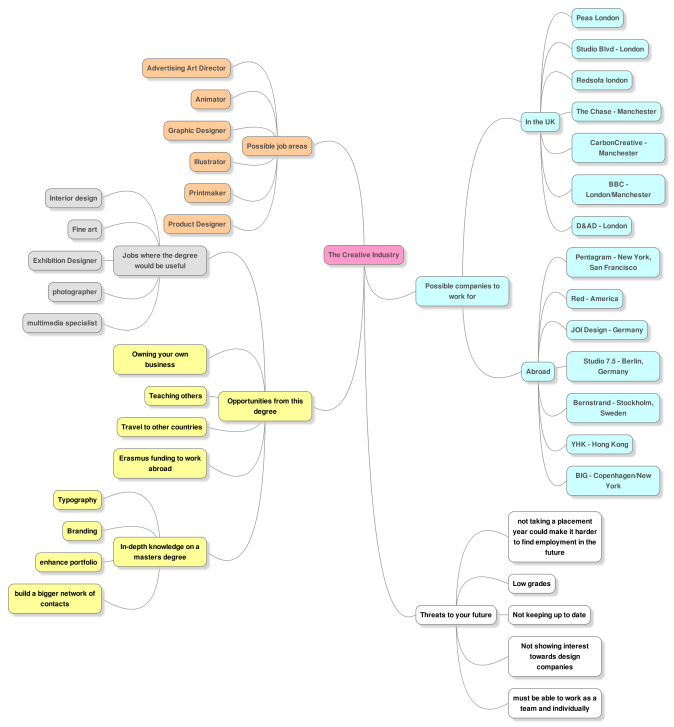
Visual Map of the Creative Industry
Following our lesson on the creative industries with Darren, I have created this visual map to highlight some of the main areas of the creative industry after discussing this in groups of three. I have defined the possible job areas that our degree could lead to, the opportunities we could have, some potential companies that we could work for both in the UK and abroad, and also the threats we may face in our future. I have realized that there is a lot to consider when progressing with my graphic design course and I feel that it is a good idea that I should have a range of plans and backup to help with my future.
I am interested in…Anthony Burrill
Antony Burrill is a designer known for his bold, persuasive and motivational communication typography. Words and output are an important factor of his work. His words ‘Work Hard and be nice to people’ has become a common mantra for designers worldwide. His work focuses on light touches of humour, with the bold text set on block colour allowing the messages to stick in the viewers’ minds, an example of simplicity having a greater effect than complexity. His work reaches out to people in a humouring rhetorical sense, communicating with them to make them decide on a personal answer. Viewers will converse with themselves in a positive way to make better life and design choices. I like Burrill’s work because although simple it is very eye catching and I feel it emotes great effect. I also like the block print effect.
A Conversation – Transcribing my letter into different languages and symbols
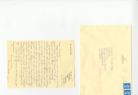
I wanted to see how letters looked when they were transcribed into different languages and symbols. Once I had transcribed one of my letters from the past, I changed the text and translated, to discover and display the different ways in which different communities and societies communicate. They range from the practical languages of Spanish and Japanese to the more unusual, like Wingdings and braille. This has pulled a letter that was written in 1949 into the 21st Century of modern day type and translation.
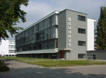
The Bauhaus and The Black Mountain College
The Bauhaus and Black Mountain College were both founded on progressive education. Both institutions are similar yet different; the Bauhaus is seen to be an influence on technology and discipline, whereas the Black Mountain College focuses on multidisciplinary influences.
The Bauhaus translates constructivism from Dewey’s idea of intelligence over reason, and his emphasis on this movement. It focused on the more experimental modes of teaching and was interested in the order of things. They were more interested in craft based culture and to experiment with our self perception of the world. The Bauhaus involved a rolecall of key designers in the 20th Century:
Laszlo Moholy-Nagy
Moholy-Nagy was interested in the machine age which inspired the functional aesthetic of constructivism on the Bauhaus. He explored the aesthetic and communicative properties which developed design sensibility. His teaching was directed towards simplicity and elemental expression, reducing variety in nature to the basic mechanical properties used to create products that had agency.
Johannes Ittern
Ittern was interested in the direct interaction with the physical world and he centralized on materiality. His students would discover the wealth of texture rather than visual aspects, as well as the combinations of textures for specific experience. His aim was to engage the senses and perception became filtered. Through material experimentation, new worlds were discovered and new art was formulated. Method mediated through the body, and he looked closely at sensations to look at the world in a new persepctive through sharpened and refined senses.
Joseph Albers
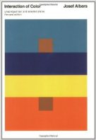
Albers started as a student at the Bauhaus and then went on to teach at the Black Mountain College. His interests lay with colour theory, and how different colours interact with eachother. He wrote a book, ‘Interaction of Colour’ (1963), in which the cover displayed colours in 4 rows with a brown square at each end. When first viewed the brown squares look different shades, however they are both the same colour, which accurately displays colour when it is interacted with and disturbed.
He describes that colour is in constant flux, and during his teaching he tried to diagram colour interaction. He intended to teach ‘seeing’, in which we would create visual empathy, through which one would gain the ability to read the meaning of form and order.
“Simultaneous contrast is not just a curious optical phenomenon, it is the very heart of painting’ – Joseph Albers
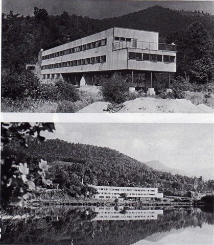
BLACK MOUNTAIN COLLEGE
Black Mountain College was a liberal arts college (not an arts college) which was common in progressive environment. The compulsory courses were philosophy and first level art, and Dewey made many visits. The site was a very open micro community, with self-grown food and the tutors and families mingled with the students. It emphasised on process rather than the conventional grades, centering the importance towards the arts. It played a formative role in the definition of American aesthetic and identity in the arts from 1950-1960, from it’s lack of order and meaning in artist work.
Eva Hesse
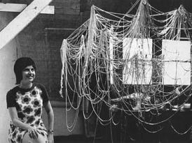
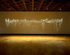
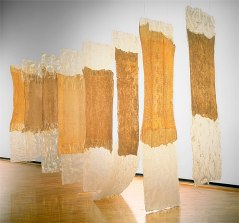
Eva Hesse was a very important asset to the Black Mountain College. She produced work with lack of colour but with bold emphasis on texture and material, skewing Albers method to form abstract means of painting. She counteracts the formalist dialogue of the 1960’s with a message of expressionism, creating large abstract pieces that defy meaning and follow a more contemporary, self directed path.
Maslows Hierarchy of Needs
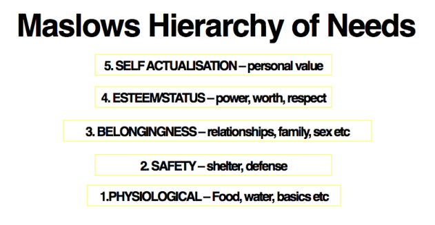
Maslows hierarchy of needs expresses how things go and need to be in relation to working towards the market. This hierarchy goes to explain a lot about the way in which society, business and even different countries works; whereas some of us are used to level 3 and 4 workings of life, some poverty ridden countries struggle to obtain the basics. The hierarchy also goes to explain how a good solid society can be broken by many factors (bad weather, disease, drought etc).
Personal Development Planning – Companies I would like to work for
At this point in my year I am starting to consider companies that I would like to work for during my placement year, which would be my 3rd year of study. I am thinking big, and would like to work for major design companies that partake in interesting promotional projects where I can learn a lot about my chosen profession as I feel it is important to learn on the job.
Pentagram is one of the top design agencies and has bases in London, New York, San Francisco, Austin and Berlin. It has completed work for prestigous companies such as Christian Leboutin, Penguin, The Savoy, 21st Century Fox and Boots. There portfolio of work spans 5 decades, and they employ one or more of their 19 practitioners to attend to clients. I would like to work for Pentagram as they focus on everything in the world of design; from magazines to books to advertising fashion.
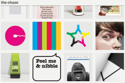
The Chase is a graphic design company based in Manchester and Preston. Whilst at high school, I completed a weeks work experience at this agency which I found to be very interesting and I enjoyed the work I did, therefore going back to get involved in more projects would be a great experience. It has created design work for Adidas, Natural Source and stamps for the Royal Mail. The company has won many awards such as the prestigious Pencil award.
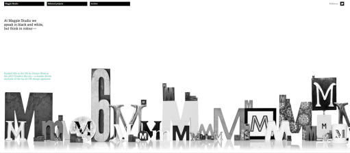
Magpie Studio is based in London, where they speak in black and white but think in colour. The studio placed 6th in the UK by design week Creative Survey and has worked for solid companies such as channel 4, BAFTA and the Houses of Parliament. Their design work is minimal yet innovative, using negative space well and a lack of overpowering colours. I feel this would be an interesting experience and I would be able to work in London which is full of design inspiration and a different lifestyle.
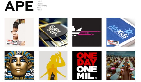
APE inc is a design agency based in London which works with graphic design and photography, which interests me as photography is a hobby that I really enjoy. The company has produced work for the likes of Nike, BBC and various book and publishing designs. The work interests me as it ranges from simple to detailed and uses a variety of media. Again being in London would be a great experience for me and I would like to learn a lot more about my passion.
E4 Brief – Developed designs
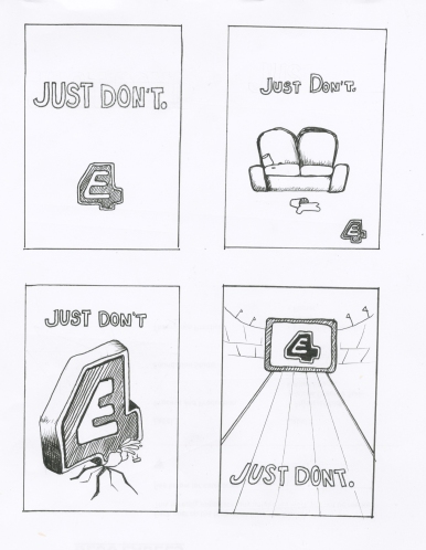
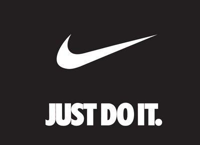
Here I developed an initial idea that I favoured from one of my ideas. When developing ideas I was instructed to choose one of my initial ideas and develop it further, which allowed me to add more detail and different variations of imagery to match the same strapline. I decided to use my first idea with the strapline ‘Just Don’t’, which I have used as a parody against Nike’s popular campaign ‘Just Do it’.
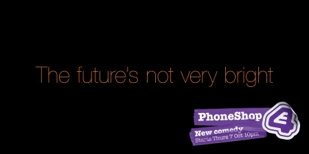
Nike is famous for sportswear and equipment, therefore the strap line ‘Just Do it’ promotes activity, healthy living and an active lifestyle. My idea was to change the strap line to ‘Just Don’t’, which emphasizes on the idea of simply sitting in front of the TV and watching E4. E4 also added a similar style to the program ‘The Phone Shop’, in which they parodied a current advert for ‘Orange Mobile’:
The adverts both use the same text therefore the parody effect can easily be identified, however the straplines are similar which also adds to the comedy. The E4 advertisement also shows that an advert can still be effective even if it is very simple.
E4 brief – initial designs
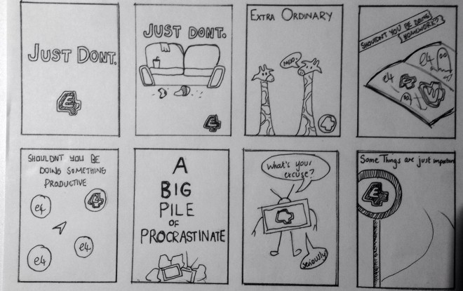
To start off with our Estings brief we were given the task to come up with some initial designs and our initial taglines to go with the designs. After coming up with a list of potential taglines I experimented with initial first ideas to get a look and feel of what the poster would look like, and it also gave me a sense of image placement when I used the rule of 3. I drew my initial ideas using pencil first and then outlined them in fineliner pen. I used 5x7cm boxes to fill a page of 8 ideas which were quickly sketched down for reference. Completing initial ideas is good practice as it allows the comparison between different ideas to determine which would be the best idea to bring forward. From these initial ideas I will choose an idea that I like and expand on this.
I am interested in…’Information is Beautiful’ by David McCandless
Whilst studying last year I became very interested in Infographics and how information can translate from boring to interesting through the use of graphic design. I bought this book entitled ‘Information is Beautiful’ by David McCandless, which is a collection of the worlds interesting (and some pointless) information which is grouped together using colour, shape and font to create a solid collection of info graphical work. Not only is his work clean, fresh and colourful, but looking at it teaches valuable information that I didn’t know before through relevant diagram. For our essay brief, we have to design an info graphic poster which visualises our essay topic in a nutshell, therefore this book will be useful as it will teach me more interesting ways of displaying information to make it more appealing to the eye, rather than information becoming lost amongst lists of plain words.
E4 Brief – Brief analysis (Wednesday 15th October)
For our studio brief in Jay’s tutorials we have been instructed to create a poster or an animation for the popular free view channel E4. This project is based along the lines of the current Esting project that e4 runs, which allows members of the public to design and send in adverts in between programs which advertise the programme. The Esting website and current entries can be seen here:
www.estings.e4.com
The focus of the poster/animation will be on the typography, graphic design and the virtual set building when using Cinema 4D. We must capture the look and feel of the E4 channel using the E4 logo (above), our personal heading for the poster, a specific focus on 3D typography, use of the e4 deep purple colour and a consideration for composition.
We must support our design with initial and developed ideas, experimentations both on paper and on screen as well as justification for our project choices. We must document all our work for this project on our blogs.
I am interested in…Sophie Calle (A Conversation)
Sophie Calle is a first-person French artist, in her works she directs herself shamelessly and unreservedly, recounting stories she has lived with a definite concern for detail. She turns the people around her, whether she knows them or not into important values in her work. Her work is simple in idea and often invading of privacy, however she uses this crude uproar to her artistic advantage. Calle’s style interests me greatly; I view her work as a way in which she converses with herself and compensates for loneliness, however as a reverse or a distortion, she gets to know people without ever speaking with them; she just likes to experience how different people react to her works.

Suite Venitienne
‘I followed strangers on the street. For the pleasure of following them, not because they particularly interested me.’Sophie intended to get to know people without talking to them, taking a distorted perspective on a conversation.

The Sleepers
‘I asked people to give me a few hours of their sleep. To come and sleep in my bed. To let themselves be looked at and photographed. To answer questions. To each participant I suggested an 8 hour stay.’ Although this suggests a stalkative attitude, There is definition within a conversation; rather than interacting with someone who is awake, she interacts with someone sleeping.
The Blind
‘I met people who were born blind. Who had never seen. I asked them what their image of beauty was.’ This is a harsh distortion which can describe how people often have conversations with themselves; we are shown how people imagine things and how much sound, touch and smell are just as important in a conversation as much as speech and sight.

Sophie Calle’s work has influenced some of my research for ‘a conversation’, as I found her work as an artist interesting and something I wanted to try for myself.

