Character Design Final cereal box

To finish off the character design module we were instructed to create a mock-up of the cereal box in which our character would appear. After creating the net and printing it I cut it out and used double-sided tape to construct the box. I am pleased with the outcome as I feel my character matches with the box design and that the box design is dynamic and would be appealing towards children. I really enjoyed this module as it taught me a lot about character creation and packaging design, and also how to construct documents for mock up and print.

Character and packaging design – final cereal box net

template

Here is my final packaging design for our character and packaging design tutorial on Wednesdays. To finish my box I created my own net by tracing an original packet. I then re-created my character in Illustrator using layers and the pen tool, and I coloured my character to make it look like a cartoon. I then opened photoshop and imported the net and I created a background using palm leaf graphics and a blue background. I imported my character and then various elements that made up the cereal box, such as the bowl of cereal as seen on most cereal packets, and the title and text, as well as the nutritional information and barcodes. I now need to print my box on card and construct it as a mock up to photograph.

This task has taught me a lot about character design and and has also taught me how to use photoshop and Illustrator better. This module has also helped me to improve my computer designing work and the importance of branding to a product.

Character and packaging design – character final

cockatoo

Here I have created my final character for my breakfast cereal. To create my character I used Illustrator; I used the pen tool to trace over my original design and used the fill and paint tools to colour the bird and add gradients at the feathers. I kept the design minimal as I will be adding a lot of elements to my packaging design later. I will now add this to my net to create my final box.

Animation – My final showreel

<p><a href=”https://vimeo.com/123197104″>Final Showreel 2nd Year</a> from <a href=”https://vimeo.com/laurenwinstanley”>Lauren Winstanley</a> on <a href=”https://vimeo.com”>Vimeo</a&gt;.</p>

In my final tutorial for animation I created a showreel which displayed all the animation pieces I have created throughout the year. I found my animation tutorials challenging however I have learnt a lot of skills throughout the year that I didn’t learn in the first  year of study. To create my showreel I used After Effects, and I imported all my videos into the same compilation. I transitioned them together using the presets and text to introduce my different films. I felt I created a successful video to showcase my work which displays my year learning new skills.

Final typography tutorial 


For our final typography tutorial with Nick we were instructed to recreate our text ideas to a large scale for display in the creative arts building. We used markers and paint to recreate the designs in the studio then we took them to the bottom of the Creative Arts building to be photographed from the upper floors. This was a good practice as it allowed us to practice on making larger scale versions of original works by using proportion and care, and the end result looked interesting when displayed on the Creative Arts floor.

Experimental typeface

Extending from the typography workshops I decided to create my own typeface, which I constructed as a drawn piece using individual objects. I completed the drawing using a 0.1 fineliner and pencil to sketch the shape of the letter. This type is intended to be a display text which I drew to practice and experiment with drawing.

Manual type workshop


In Monday’s workshop we completed a session creating our own handmade type. This was similar to our previous workshops with Nick, however we were instructed to sketch a full typeface using the grid provided. I experimented with sketching lettering designs and colouring the letters, and I then defined the type by enlarging the letters using the detailed grid. i used pencil and fine liner to construct my letters.

Animation – Huddersfield Infographic

For the lesson on Wednesday 18th February we were instructed to create a short 10 second info graphic advertising facts about Huddersfield University. The ten second videos will be compiled as a class and displayed on a large projection on the side of the building.
I used after effects to create this short clip; I created my shapes in Adobe Illustrator and imported these into two composition files. I compiled these at the end and added animation presets and changed the position and rotation to animate my shapes on and off the screen. Once finished I rendered the piece and sent it to a file on the university server, in which my video will be used to display as part of the animation.

Typography – creating a type piece

Here is a typeface piece I created which is extended from the work I did previously. I used pencil to sketch out each letter on an A5 piece of paper and I used fineliner to shade and print the lettering. I then used promarker to colour the middle of the letters. Once I was done I attempted to make different quotes with my lettering using the white  boards in the studio. I really enjoyed this lesson as hand drawn type is something I enjoy doing, and I was happy to spend time in the studio getting it perfect.

Character Design – Incorporating the character onto a template

image1

Here I incorporated the character into a mock template of the cereal box, giving an idea of how the character will look when it is put with text and a cereal bowl. These are rough sketches which I will use to create my finished design in Adobe Illustrator. I used the shape exercises I completed previously when sketching my character to determine uses for each body shape.

Character development and sheet

image

To develop my character designs I took the character i liked the most and created a character sheet to illustrate the different shapes of the character for the breakfast cereal. I drew the bird in different shapes using pencil and fine liner. This exercise was to get to know our characters and their formations to draw them correctly in different positions.

Character Design Initial Ideas

IMG_0841-1

For our new brief we will be learning about character creation and packaging design. The aim of the brief is to invent a new character that will appear on a new breakfast cereal.
To begin the research we were instructed to sketch quick ideas to form an idea of a character. I quickly sketched some brief cartoons in pencil and fineliner pen. The designs are not intended to be final; these are just brief ideas which can be edited upon later.

After Effects 3D Cameras

To start off this tutorial we had to first create an image in Illustrator with 6-8 layers, each element of the layer being a different colour.

Screen Shot 2015-01-28 at 09.55.23

I then extended the workspace and imported this into AfterEffects. I changed the composition so that it was smaller than the original artwork, and that the composition time was 10 seconds long.

I then selected all the layers and toggled the 3d option. Each object now has three different dimensions.

Screen Shot 2015-01-28 at 10.00.17

I then created two views of the screen by changing 1 view to 2 views – horizontal which gave two outlooks of the artwork. The screen with the yellow corner is the active screen.

Screen Shot 2015-01-28 at 10.07.58

From the two screens I zoomed out and used the right hand screen to adjust the artwork so that the artwork fit to the composition space. I did this by adjusting the x and y values. I then clicked ‘layer’ > ‘new’ > ‘camera’

Screen Shot 2015-01-28 at 10.22.32

I changed the settings to ‘two node camera’ and a 35mm lens. I also deselected the depth of field.

Screen Shot 2015-01-28 at 10.35.53

I then moved each layer so that they were positioned apart from each other and I moved the camera out. I set the keyframe so that when I played the compilation it  zoomed out on the scene slowly.

Creating a moving picture in After Effects

<p><a href=”https://vimeo.com/127155567″>bottle video (Converted)</a> from <a href=”https://vimeo.com/laurenwinstanley”>Lauren Winstanley</a> on <a href=”https://vimeo.com”>Vimeo</a&gt;.</p>

The aim of creating hand-drawn pieces is to animate fluently and sometimes ruggedly to create ‘moving pictures’; objects that stand still but are still full of motion.
To make this I chose a subject matter and drew three quick images which were all different slightly. I then imported these into After Effects and created a composition, layering these images on top of each other.

2import files

1layers of bottles

On the timeline I let each image show for a second by placing each section of animation one after another, so the images appeared in stages. Once I had done this for three seconds I copied each of the layers and pasted them so they filled the composition time, whilst always dragging the timeline points so that they were staggered across the timeline, resulting in the moving image shown above.

26th November – Workshop on securing a placement

For our group work today we worked on thinking towards securing a placement for the next year. As a group of 3-5, we were given the task of realizing the key aspects of searching for and securing a placement.

How to find companies that might be interested in taking you on a placement…
As a potential worker for the company, you want to apply for a company which appeals to you. We must consider what we most want to do/get from our futures and consider which companies will help us do this. We must search on particular job websites, like ‘it’snicethat’, for companies which actually want placement applications, rather than pestering companies that don’t. Social networking can also be used to put your CV across to people in an informal way; you never know who could see your work and spy your talent.

What is the best way to make contact with potential companies?
Emails and letters are the standard ways of contacting potential employers. Phone calls are also good for first impressions however there is no way to show work.

Pros of Emails – efficient, straightforward, easier to link the reader to websites/portfolios
cons of Emails – easily deleted, could possibly end up in the spam box,

Pros of letters – most likely to be noticed and opened, intriguing
Cons of letters – old fashioned, easily misplaced, not environmentally friendly

How to put together and design a portfolio?
Portfolios should be 20 pages of printed work or 30 pages if the portfolio is pdf based. They should demonstrate a rounded nature and should be company specific to address their wants and needs directly. It should always be up to date and should be easily to get to and to navigate. We should be using our best and most recent work, and they should allow room for discussion, context and feedback.

How to request feedback
You can send a follow up email, requesting advice on your portfolio. Ask for feedback on the first contact, ask more questions at the interview and definitely ask how you could improve; believe that there is always room for improvement.

Follow up do’s
Include on your cover letter when you will contact the potential company. Make sure you have the correct title/names/contact details of the person responsible. Be patient as companies may be busy on a project, and alert your references that they may be receiving a contact soon. Send a thank you note, and continue to sell yourself at all times in a non-arrogant way. Try to be memorable in any way you can, by for example, including business cards. Always ask for feedback as it shows that you care about your work and progress.

Follow up dont’s
Don’t harass the company; it isn’t fair on the business as they may be extremely busy. Don’t place too much importance on one job as you may be disappointing and have nothing to fall back on. Don’t stop looking for other placements; you may find something that you want more than the previous offering.

E4 Brief – creating the E4 logo in Cinema4d

In this tutorial we learnt some of the basics of cinema 4d and how to create 3d objects using illustrator files.

We firstly created a number of folders which will contain all of our work. This is so we could keep our working methods separate from our outcomes.

files

I then opened the E4 logo which I had saved in illustrator from the unilearn page. I made the page full screen and clicked the cross between the two rulers, dragging it to the centre and snapping it to the middle. I then used the ‘artboard’ tool, which allowed me to crop the white negative space down so it fit round the e4 logo. I then saved this file as an ‘Illustrator 8’ file, as this is the latest version which is compatible with cinema4d.

I then opened cinema4d and changed the render settings so that the output was A3, the pixels changed to millimetres , and allowed shadows and changed the action safe to 95%. I saved this as a template.

I then created the scene. I double clicked on the material area to create a mat ball. I clicked & dragged it into the background and floor. I then selected the floor, then tags, then cinema4d tags. Then compositing > compositing background. I then saved this as the scene template.

I then wanted to add the logo document. To do this i selected merge > file > then imported the illustrator file. The logo appeared along with the red, green and blue arrows which represented the X, Y and Z dimensions. I dragged on the green arrow until the logo was touching the floor. I then used subdivision > extrude and dragged the e4 logo onto extrude in the layers panel, making sure the arrow was pointing down then I did this. The logo then became 3d. To change the thickness of the 3d I dragged the z axis. To create rounded edges I changed the caps option to ‘fillet cap’, with 3 steps and a radius of 0.5cm.

In the unilearn area there were purple and white versions of the E4 logo. I saved both of these and then merged each with the cinema4d document and merged each with extrudes, naming these both ‘purple’ and ‘white’.

To add colour to my document I clicked in the material area to create a new material. I used the colour picker to change it to white and I unticked luminance in the basic settings to remove the shadow. I dragged this material onto the extrude named ‘white’ to colour the object. I then repeated this with the purple colour, using the RGB settings of R at 110, G at 30 and B at 125. This gave the purple of the e4 logo. I moved this onto the purple extrude. I changed the purple object movement to 150(z) and the white to 120(z). I then moved the white path over the purple path to reveal the colours.

Screen Shot 2014-11-19 at 11.35.10 Screen Shot 2014-11-19 at 11.36.23

I right clicked on the two extrudes to group them together. The new layer was named ‘null’ even though everything is still in the hierarchy. I changed this to ‘logo’.

My next task was to add text. I selected MoGraph > MoText. I changed the alignment to the middle and changed the text to my logo. I changed the colour by adding a material onto the text and I also got rid of the reflection.

I then added a bend to my text. I created this as a layer and dragged it onto the text layer to activate it. I clicked ‘fit to parent’ to make it surround the text. I manually entered the co ordinates for the R.P at 90 degrees and the R.B at 90 degrees. I went back to the object and again clicked ‘fit to parent’ to change the strength.

Screen Shot 2014-11-19 at 12.02.23

I then revealed the logo again and selected the scale tool. I clicked on both areas of the logo to scale the whole thing. I scaled the logo so that it sat between the gap in the text.

Screen Shot 2014-11-19 at 12.24.58

I then created a camera and positioned it in front of the logo. The camera would act as a first person point of view. I added lighting to my work and used the red and green arrows to position the light so it was above the image to illuminate it and create shadows. I changed the general settings so there was no illumination. I tinted this light slightly blue.

I then added another light to the right and behind the text, shining onto the other shadow to lessen the harshness of it. I tinted this slightly orange. I added another light which faced behind the text to give the logo a glow, and I changed the background to a darker grey so it could be seen clearer.

Screen Shot 2014-11-19 at 13.00.43

Screen Shot 2014-11-19 at 13.01.26

HD Rendering Rotoscope

<p><a href=”https://vimeo.com/110355452″>HD rendering rotoscope – 29th October</a> from <a href=”https://vimeo.com/laurenwinstanley”>Lauren Winstanley</a> on <a href=”https://vimeo.com”>Vimeo</a&gt;.</p>

Here we learnt how to complete a basic animation using a short video and rendering. We used the pen tool to draw round our figures and then repeated this to fit the animation. Once we had a short animation we then used solid fills to colour themask we had created, so that we had a figure which moved on a block colour canvas. A simplistic video , however a very confusing task.

Project 2060 – Imaginary Projects that a designer may engage with in my future world

For our next task we were asked to consider projects which we may have to undertake in 2060, abiding towards the changes of the world and listing the skills, understanding and anything needed for the designer to successfully operate.

I imagine the future world to be struggling with population growth and therefore problems with resources. It is something that is reminiscent of the World Wars where food was rationed, and this is causing conflict between societies. 

Here are some possible scenarios that designers may have to consider to tackle/deal with this problem:

Promotion of food rationing

Designers may have to consider making the food rationing system look more appealing to the population as it will be a growing problem. There may be ways in which they have to promote users to grow their own crops in order to survive.

The building of controlled farming areas

Designers may have to take an architectural route in the future by designing future buildings and areas to control self grown farming. The areas would be controlled for the best growing conditions to fight against the changes in weather, as global warming and deforestation may cause problems with oxygen and bad weather. Designers could design the building and how it functions, as well as promotional material for the process and also job advertisements.

Anti – war propaganda

The loss of food may cause fighting among populations and eventually break out in war, therefore designers could help create promotional materials to stop fighting and consider the needs of others. Encouraging people to help out and control their food intake could be really helpful towards the development of modern society.

Project 2060 – Future issues and it’s effect on the future designers

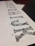
Forming new groups, we were given the task of imagining the world in 2060. Based on the average age of the group and the current regulations, this is approximately the date when we would be eligible for retirement and a state pension. We were instructed to think about the impact the world would have on various problems and how we could overcome it, or even be defeated by it:


Environmental Issues:

The world is already facing problems with global warming and deforestation, which has rapidly increase over the past 20 years due to new technology using up more carbon emissions. By 2060, oxygen may be at a lower level due to the reduction of green plants, which could risk our quality and quantity of life. The increase in temperature could also result in plants dying out and certain environments becoming unsuitable for some animals/humans, and it is unknown what small difference could impact the world in a big way.

This change could impact future designer work because of the problem of deforestation; trees are needed for paper however trees are more importantly needed for oxygen. Designers will have to resort to alternative methods such as using electronic designs or limiting designs to only being produced digitally.


Peak Oil (Reduction of oil stocks and rising prices)

Oil is already considered expensive as we use it so widely across the world. The increase in consumers buying automobiles has also rapidly decreased the amount of oil, therefore alternate methods are trying to be devised to get round this. By 2060, oil may have run out completely or in very short supply. This will effect travel and people may have to resort to electronic alternatives, like electric cars. Plastic is made from oil and is widely used across the world, therefore we may have to adapt to eco friendly methods, like decomposing packaging.

This could affect design work for designers as they will have to consider eco friendly design more. With oil at risk, plastic may have to be used sparingly, so a design threat would be designing without the use of wasteful materials.


Population Growth (effect on resources etc)

With the earth’s population growing all the time, this is having an effect on the resources of the Earth; they are rapidly decreasing and by 2060 supplies may be short or completely wiped out, which can also be affected by the reduction in oil and the environmental issues. We may have to survive on renewable sources and growing our own food.

This will affect designers as resources may be few and far between to design with, including digital equipment, and we must consider ways in which design could be as minimal as possible.


War and Political Instability

War is common in this day and age and there is no telling what conflicts will have risen by the time we reach 2060. Humans could continue to disagree, forming more wars and rivalries between countries than what is happening already, increasing the violence and lack of safety in societies. This could also heavily divide the world into rivalries that cannot be stopped. On the other hand, war may have also been abolished and the Earth may be a more cooperative place.

This could affect design as designers may be under pressure to create without upsetting other groups of people which causes more problems. However design may become easier if different groups get along with each other.


Disease

Disease is something that will either be abolished or made worse. With increasing medical technology and funding, hospitals and scientific development may have found ways to overcome unfortunate diseases, such as cancer, making life last longer. On the other hand, the increase in toxic carbon emissions and global warming could increase the severity of bad illnesses, and with population increase, hospitals may struggle to cater for all patients.

Design may be affected as designers will be commissioned to raise awareness about illness spreading. If more hospitals are needed, then designers will need to design the hospitals, including various treatment rooms and facilities.