Fish & Fizz Pub Poster

fish-fridays-butlers-01

In keeping with a nautical theme I created a poster for The Butlers Arms for a ‘Fish and Fizz’ fridays special, keeping to three colours and using the facebook, twitter and pub logos for advertising. The poster was aimed at an older audience, aiming to combine a British classic with a modern dining out experience.

Munchthru Delivery Van

As part of my Summer graphics work I was commissioned to create a design for a van print for a new takeaway company. The brief was very specific and requested certain aspects and for me to create a character for the company. The client stressed the use of the galaxy background and how the logo and text should look, as well as the choice of text.

mockup-01

When creating this for the company I had my doubts about the design however it was what the client requested and I wanted to work to their needs.

In the end I was very pleased with the final results and will now proceed to create flyers and business cards for the product.

Client Work – All my work from October 2014

Here is all the client work I have completed since October 2014, which allows me to practice my graphic design skills within real client-based briefs.

My designing business has helped a lot with my client work; I have learnt a great deal about the financial side to graphic design, such as profit and invoices, which has helped with the documents that needed to be sent with the designs. The lecture on The Design Process really helped with these creations as it taught me about what the client expectations are and how to structure my approach towards each project. I have needed to communicate with the client on a regular basis and the design process has helped me to understand meeting the needs of the client and the consumers that would benefit from each advertisement.

Client Work – Car Boot Sale

car boot sale bronte blue

For the Bronte Pub I was asked to create a poster advertising their Car Boot Sale date. The poster had to be eye-catching and incorporate blue and green colours. I also had to include cartoon styled cars, so the theme felt family friendly yet also needed to incorporate more of a masculine feel. I had to use the Heritage Inns logo and the Facebook and twitter logo to advertise their online services.

Client Work – Burger Week

burger week bronte


For the pub chain I was asked to create another poster advertising a Burger Week at one of the pubs. I was given examples for a brief and the wording which would go on the poster, with instructions to include a Facebook and twitter logo and the pub logo. I decided to create this layered burger design to incorporate the text as ‘ingredients’, with a burger bun topper at each end. I felt this would be quirky and outstanding which would be helpful towards attracting customers. This is my favourite design that I have created for the pub chain as I found it the most interesting.

Client Work – May Bank Holiday Pub Advertisement

may-bank-holiday-bronte

For my latest client commission I was asked to complete an advetisement for May Bank Holiday events happening at the Heritage Inn Pubs. I was sent a word document containing text information for the posters and was given the brief of a Spring/Summery theme to attract customers to the activities. Once I had created my idea I sent the designs to the PR who forwarded the design to the manager. Once the design was approved I then changed the name of each pub and the contact details so that the posters could be printed and distributed to the pubs across the country.

Client Work – Easter Weekend

EASTER WEEKEND

For my usual client, the Heritage Inn Pubs, I was commissioned this morning to create a poster advertising the Easter weekend they are hosting. which intends to advertise events that are happening over the Easter period. I was given a document which contained the correct information about each individual pub, and the task of making a bright and colourful poster with an easter theme. I decided to use bright colours and large, curvy text, with handwritten styled secondary text. I also created a graphic of a cracked easter egg for the background. Again I had to use the twitter and Facebook logo, as well as the logo for the Heritage inn.

Client Work – Mother’s Day Poster

mothers day bronte

As Mother’s Day is coming up on the 15th March, I was commissioned to create an advertising poster for the Heritage Inn pubs. I was given the brief with freedom of design, however I had to use the text in the document guidelines that was provided, containing details of contact numbers and the correct names of the pubs. Once my design had the approval of the client, I sent the pdf documents to be printed. My poster will be displayed across the pubs and will hopefully make a great contribution to attracting business for Mother’s Day. I find these small jobs very useful as it gives me a taste of what working for a larger client would be like, and also gives me a chance to practice my designing collaboration skills when working in the future.

Valentines Day Client Work

valentines day

For the ‘Strawbury Duck’ pub in Bolton I was asked to create a Valentines Day poster, advertising the deals for the day in an eyecatching way. I was allowed to use any design I wanted, however I had to include the right information and the logo of the pub, plus the Facebook and twitter logo. The poster will be displayed in the pub in the month leading up to Valentines Day.

Personal Work – Creating a New Years ticket for the Strawbury Duck

new years eve ticket

I was commissioned to create tickets for the New Years party at the Strawbury Duck pub in Bolton. The ticket had to briefly match the original designs I had created and include the exact text that was sent to me. I I had to use the facebook logo, the christmas logo for the pub and the logo’s of the special guests appearing that evening.

I am really happy that my work is being featured in pubs across Lancashire and Yorkshire, I have received good feedback so far from both the PR team and people visiting the pubs.

Personal Work – Christmas and New Year pub posters

christmas party blackbull new year butlers

For the festive season I have been commissioned to create advertisements for booking Christmas and New Year parties for pubs that belong to the ‘Heritage Inn’ groups; ‘The Strawbury Duck’, ‘The Black Bull’, ‘The Devonshire Arms’, ‘The Butlers Arms’, ‘The Green Man’, and ‘The Brontë Pub and Restaurant’. I was given the brief to make the posters simple yet festive, with text to advertise the meals on offer and facebook, twitter and the pub logo at the bottom. I used party themes and festive colours to stick with the christmas theme . I repeated each design across the pubs. My client was pleased with the results and

Personal work- recreating a Halloween advertisement poster

A friend who works for a chain of pubs in the North west asked me to recreate the poster for the annual Halloween Bonfire party. Here is the original poster:

10694962_10204580466500974_1748586420_n

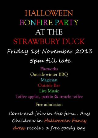
As displayed the original design lacked in eyecatching presentation. I felt that there were too many colours used and that the text lacked in professionalism. I therefore was instructed to improve the poster as part of the advertisement for the parties. I created this poster for the ‘Strawbury Duck’:

halloween poster

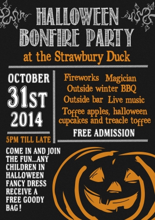
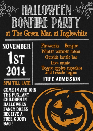
This is my improved design for the Strawbury Duck poster. I simply used three colours as I feel less is more, and included a simple graphic, however I used bold and decorative text so that it stood out. I feel that the white on black is eyecatching to the public, and I feel the orange adds a definite halloween feel. After creating this I was then instructed to alter the same poster for another pub putting on the same party:

halloween poster green man inglewhite

Personal Work-Chrono Hub improvements

 6ST Hub Poster


My brother is an employee at Lancaster University and works in programming, and often provides small tasks for me to improve my graphic design skills, whilst also improving my experiences in working with live briefs. 
My brother was instructed to create a poster for a system he is designing (the original poster is shown above). I was simply instructed to make the poster look better and more professional. Here is my improvement:

chronohub -Recovered

To improve I limited the choice of colours because I feel that less is more, and makes a poster look more professional. I used a simpler text, and used tracking and kerning to make the titles look more interesting. I used the original iphone pictures and used my own photograph for the background, changing it to black and white so that it didn’t detract too much attention from the text. The client approved of the new poster.