In my lecture today we looked at cubism and futurism, and the styles and movement of history in art and design.
We first talked about the idea of ‘The Canon’. The canon is considered to be something that is the perfect art, canon meaning ‘The Rule’. in history, the statue ‘Doryphorus’ by Polykleitos was considered the perfect art.

We can now have an idea of the modern canon, which is short for things that are accepted in modern art.
Style of an art depends on various characteristics, such as look, form and appearance. There are ‘canonised styles’ through art history which easily identify a look of something to a period of time. We identify styles like modernism, art noveau, cubism and futurism tbecause we recognise them as an art movement, which is a style with a philosophy or goal. The styles tend to overlap and influence eachother, and this crossover can be critical, as we ask when does one style become another?
An artist who worked within different art movements was Pablo Picasso. His first works were very plain and simply drawn which suggests realism, however if we move on into his later works then we can identify much wilder ideas of cubism.


This shows an obvious shift in art culture and style, and it is uncommon for an artist to stray from original styles to try out another. We identify Picasso mostly through his cubism influenced pieces; when faced with one of his still lifes,we wouldn’t guess straight away that it was Picasso.
As time went on, art noveau becan to fade and was gone by 1914. The movement faced challenges; it rejected the industrial age and focused on prettier natural aspects of life, when the world was going in a different direction. Fashions changed, and the world just wasn’t interested in the floral design; they were looking into a future of modern looks influenced by the machine age.
A popular icon of this theory is Lucian Bernhard, who was an amateur designer from Munich.

He created this poster for Priester matches in which he entered into a competition, which would influence and affect advertising culture in the future. Instead of adding to his poster, he decided to take away the elements which didn’t advertise the message of the product or convey the message of the poster, leaving just the name and the object. Although this was a simplistic design, it forced the viewer to challenge the mind to decipher the message. This formulated the theory that ‘less is more’, and the influence of the object poster formed the modern simplistic poster, by whittling down to the basics of design.
Cubism is a movement with a simple, modern aesthetic. It started out in Paris and was developed by Picasso and Braque.
The aesthetics of cubism are generally broken up, fragmented and distorted with a limited colour scheme. It works with multiple perception, interception with a definite conceptual feel. It is a dramatic shift from realisms representation of reality, and portrays the idea of time, movement and the 4th dimension.
“A head is a matter of eyes, nose and mouth, which you can use any way you like” – Pablo Picasso
Critisism of cubism lay with avant garde rejection and the idea that if the piece is rubbish but a name is added to it then people will buy it anyway.
Cubism can be split into two types-analytical cubism and synthetic cubism. Analytical is angular, only uses certain colours and is technically geometrical, whereas synthetic emphasises on collage, simpler styles and bright colours.
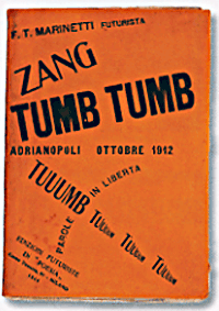
Futurism was launched by Filippo Tommaro Marienetti in 1909.
Futurism had set rules; it was radically right wing and was seen as a revolutionary movement. Unlike cubism, it progressed into a more aggressive and violent era, influenced by the machine age. It contrasts with the art noveau, rejecting anything old and focusing on progression and technology, social change and innovation.
It glorified the future concepts of change, like propaganda, planes and machines. A big influence in futurism was the typography; it rejected harmony and often incorporated many different fonts on one page. Dynamic, bold scripts and velocity incorporated a shouting look, giving the idea of words with freedom. The futuristic typography was contradictory to embracing the machine, because of the lack of structure and form. It influenced contemprary design now through the use of words and sentences on different angles, and the sculpturing of text to shapes.


In conclusion, I feel that the movements of cubism and futurism, although contrasting in some way, heavily influenced contemporary design today.