In further research to the work of Anthony Burrill I decided to have a go at creating my own interpretations of his work. I used two different fonts and made sure that they were a vintage headline style, as displayed in his work. Although this task may look easy I actually found it quite challenging; I took a lot of time in the placement of the text and trying to get the text all central to one another, as well as deciding on the correct text size and the ratio between used space and negative space that I wanted to balance well. I also spent a lot of time on picking the colours; not too bold so that it doesn’t pull attention from the text and also so the text is readable, so I chose more pastel colours. I feel that this is a good form of art communication as it translates messages that almost shout out at the viewer and force the viewer to read the message due to the simplistic nature of the artwork.
Tag Archives: artist research
I am interested in…Anthony Burrill
Antony Burrill is a designer known for his bold, persuasive and motivational communication typography. Words and output are an important factor of his work. His words ‘Work Hard and be nice to people’ has become a common mantra for designers worldwide. His work focuses on light touches of humour, with the bold text set on block colour allowing the messages to stick in the viewers’ minds, an example of simplicity having a greater effect than complexity. His work reaches out to people in a humouring rhetorical sense, communicating with them to make them decide on a personal answer. Viewers will converse with themselves in a positive way to make better life and design choices. I like Burrill’s work because although simple it is very eye catching and I feel it emotes great effect. I also like the block print effect.
I am interested in…’Information is Beautiful’ by David McCandless
Whilst studying last year I became very interested in Infographics and how information can translate from boring to interesting through the use of graphic design. I bought this book entitled ‘Information is Beautiful’ by David McCandless, which is a collection of the worlds interesting (and some pointless) information which is grouped together using colour, shape and font to create a solid collection of info graphical work. Not only is his work clean, fresh and colourful, but looking at it teaches valuable information that I didn’t know before through relevant diagram. For our essay brief, we have to design an info graphic poster which visualises our essay topic in a nutshell, therefore this book will be useful as it will teach me more interesting ways of displaying information to make it more appealing to the eye, rather than information becoming lost amongst lists of plain words.
I am interested in…Sophie Calle (A Conversation)
Sophie Calle is a first-person French artist, in her works she directs herself shamelessly and unreservedly, recounting stories she has lived with a definite concern for detail. She turns the people around her, whether she knows them or not into important values in her work. Her work is simple in idea and often invading of privacy, however she uses this crude uproar to her artistic advantage. Calle’s style interests me greatly; I view her work as a way in which she converses with herself and compensates for loneliness, however as a reverse or a distortion, she gets to know people without ever speaking with them; she just likes to experience how different people react to her works.

Suite Venitienne
‘I followed strangers on the street. For the pleasure of following them, not because they particularly interested me.’Sophie intended to get to know people without talking to them, taking a distorted perspective on a conversation.

The Sleepers
‘I asked people to give me a few hours of their sleep. To come and sleep in my bed. To let themselves be looked at and photographed. To answer questions. To each participant I suggested an 8 hour stay.’ Although this suggests a stalkative attitude, There is definition within a conversation; rather than interacting with someone who is awake, she interacts with someone sleeping.
The Blind
‘I met people who were born blind. Who had never seen. I asked them what their image of beauty was.’ This is a harsh distortion which can describe how people often have conversations with themselves; we are shown how people imagine things and how much sound, touch and smell are just as important in a conversation as much as speech and sight.

Sophie Calle’s work has influenced some of my research for ‘a conversation’, as I found her work as an artist interesting and something I wanted to try for myself.
New Visual Language Research – David Carson
David Carson is an American graphic designer, and is best known for his innovative magazine designs and his use of experimental typography. His work is mostly featured in magazine ‘Ray Gun’, in which he demonstrated his well known abstract layout skills. He was a pioneer for the grunge style, and the ‘grunge typography’ era. He is one of the most influential graphic designers of the 1990’s, working for companies such as Quicksilver, Nike, and even Barack Obama’s campaign.
His work is heavily influenced by postmodernist ideas and styles. He abandons all forms of grid systems and columns, headings and even page numbers, which immediately dismisses a modernist view of order and structure. In fact, his work was often barely readable, however this made the viewers focus on his skills as a postmodern designer, rather than a writer. His lack of rules is definitely identified in one issue, in which he uses the font ‘Dingbats’, widely known as involving no letters at all, to add a parodying value to a dull interview with Bryan Ferry. His pioneering grunge design definitely follows laws of postmodernism; the typefaces tend to overlap and break up, which rejects modernist views on order. There is not much that can be said about ‘depth of surface’, the idea of Carson’s design is to simply create nonsense out of serious articles, and therefore all the meaning is seen on the surface. His work follows postmodern ideas of play and irony, as well as challenging the serious of modernism, and this is obvious through his deliberate inability to keep to original articles and just design the page layout; he almost makes a mockery of the idea of interviews or articles by painting over them and even making them unreadable. Carson tells future designers to ‘trust their gut and enjoy working on it, rather than obeying design laws.
New Visual Language Research – El Lizzitsky
El Lizzitsky is a Russian artist and designer who was a heavy influence on modernism, through movements like cubism and constructivism, and his work heavily influenced the iconic Bauhaus company. His Russian style was influenced, and used, by the Soviet Union. He believed, like the modernist viewpoint, that the artist could be an agent for change, which he later summarized as ‘goal orientated creation’. He was heavily influenced by his study as an architect, and was most known for creating pieces called ‘Prouns’, which were abstract pictures that he described to be ‘the interchange station between art and architecture’.
His style definitely follows a modernist movement as it favours abstraction, and it rejects any historical or religious reference or meaning. It is self-centered, and achieves itself through individualism. The forms of the shapes are very sharp; we can tell what sort of shapes have made up the image, and most of the designs seem to follow a particular direction; all shapes are usually aligned equally along one diagonal. The design also has particular depth over meaning; Lizzitsky tells us his ‘Proun’ collection relates to architecture, and this sense of meaning is something modernism follows. The designs are restricted in typeface as the designs including type use Russian-style fonts, and they are also restricted in colours, as each piece has a specific colour scheme only ranging from two or three colours.
Design in Context 1 – Researching Manifestos – ‘What Our Art Means’ – Gilbert and George
| ART FOR ALLWe want Our Art to speak across the barriers of knowledge directly to People about their Life and not about their knowlegde of art. The 20th century has been cursed with an art that cannot be understood. The decadent artists stand for themselves and their chosen few, laughing and dismissing the normal outsider. We say that puzzling, obscure and form-obsessed art is decadent and a cruel denial of the Life of People.
PROGRESS THROUGH FRIENDSHIP Our Art is the friendship between the viewer and our pictures. Each picture speaks of a „Particular View“ which the viewer may consider in the light of his own life. The true function of Art is to bring about new understanding, progress and advancement. Every single person on Earth agrees that there is room for improvement. LANGUAGE FOR MEANING We invented and we are constantly developing our own visual language. We want the most accessible modern form with which to create the most modern speaking visual pictures of our time. The art-material must be subservient to the meaning and purpose of the picture. Our reason for making pictures is to change people and not to congratulate them on being how they are. THE LIFE FORCES True Art comes from three main life-forces. They are: – THE HEAD In our life these forces are shaking and moving themselves into everchanging different arrangements. Each one of our pictures is a frozen representation of one of these „arrangements“. THE WHOLE When a human-being gets up in the morning and decides what to do and where to go he is finding his reason or excuse to continue living. We as artists have only that to do. We want to learn to respect and honour „the whole“. The content of mankind is our subject and our inspiration. We stand each day for good traditions and necessary changes. We want to find and accept all the good and bad in ourselves. Civilisation has always depended for advancement on the „giving person“. We want to spill our blood, brains and seed in our life-search for new meanings and purpose to give to life. Gilbert & George |
This manifesto is called ‘What Our Art Means’ by Gilbert and George. It is a manifesto written by them about their own work; however I feel that once I had read it, it relates to a lot of current art. The manifesto first describes how they want their art to speak across barriers of knowledge and about people’s lives. They feel that the 20th Century has been cursed by art that can’t be understood, therefore they want their art to reach out to all people, rather than just people who understand art, as it were. They say that puzzling art is a decadent and cruel denial of the life and people, therefore, they are describing that art should be creative yet mundane so it can be understood by everyone.
‘The true function of Art is to bring about new understanding, progress and advancement.’ – This means that art should be understood by everyone, it should be current and it should be modern. Art is not just for critics or people who have a deep philosophical understanding of renaissance art. Art should relate to everyone, and not just to an exclusive club of critics. Everyone should understand the development of art over the decades.
The manifesto also describes how they are constantly developing their own visual language through their work. This means that no words or description are needed, that people should view a piece of work, and the only thing that is important is how the piece translates in their mind. They describe how they want to change people, not congratulate them on being how they are. I agree with this statement, as the majority of art is created towards what people want, not what is already there. They also describe that the art material must be subservient to the meaning and purpose of the picture. This means that the topic that art is based on must be reflected in honesty and with appropriate references in the work, not manipulated into something it is not. ‘What Our Art Means’ also describes true art coming from three main life-forces: The head, the soul and the sex. They describe that the forces are ever-changing into different arrangements and that this is reflected in their art, which means that they describe combinations of different aspects of life through their work and practice. They also describe that as artists we want to find excuses to continue living, to find and accept all the good and bad in ourselves, to spill our blood, brains and seed in our life search for new meanings and purpose to give life. This means that we want to find things to excite our every day and discover things new through creating, to accept everything within ourselves in an attempt to appreciate art, and to literally do anything and give our all to discover creativity and through this discover new life.
I feel that all this is very significant in society as it describes art as being for everyone. I think this is important as art is a major part of education, without art, learning and discovery would prove boring.
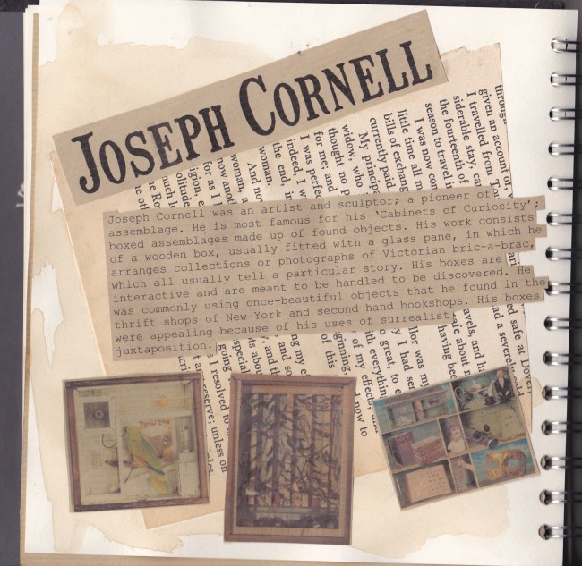
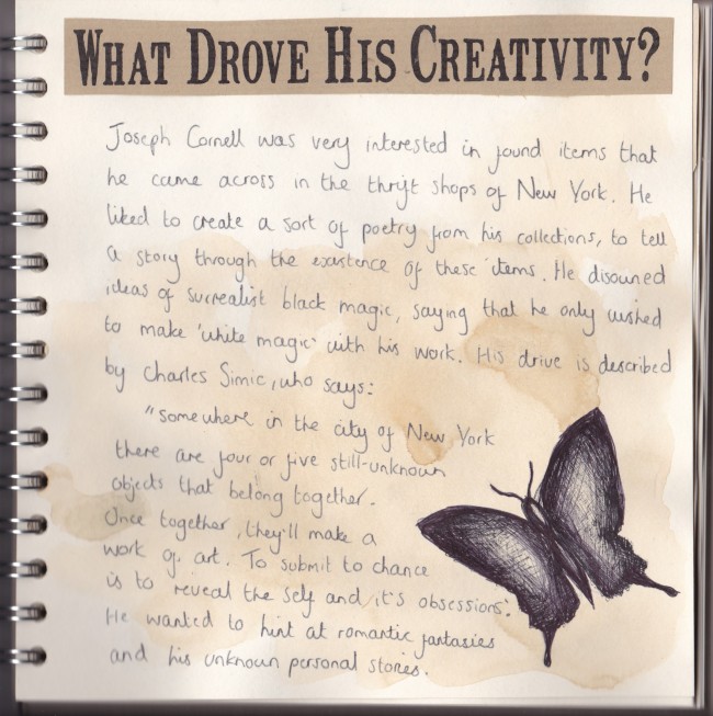
Design Practice 1 – Cabinet Of Curiosity – Research on Joseph Cornell
Work Inspired By research on Simon Fairless
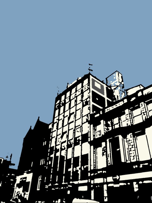
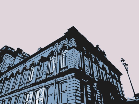
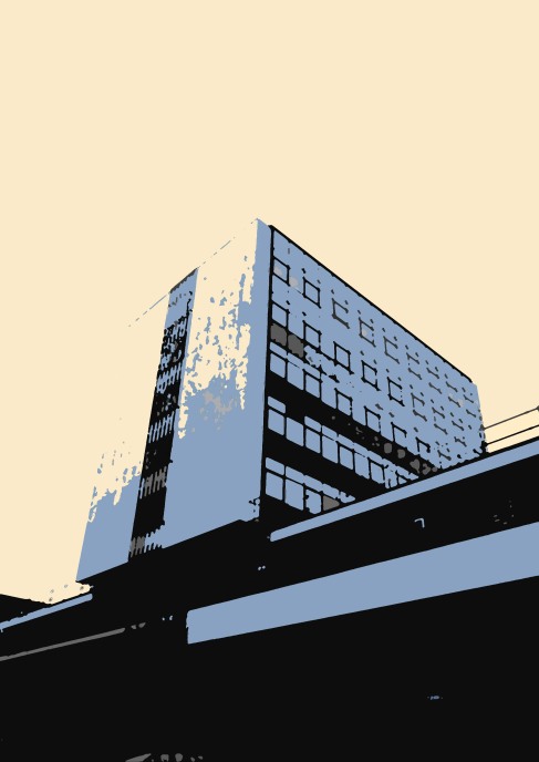
As part of the research stages of my project I decided to conduct research on artist Simon Fairness. Simon is a painter who creates abstract visions of the city in simplistic, stencil type designs. To research this I created my own digital versions of his work. I used my own photographs and used the ‘cut out’, ‘dry brush’ and ‘poster edges’ filters to create his patchy, painted style in photoshop. I lowered the amount of levels in the image to three so that only three blocks of greyscale colour showed up. I then used the ‘select’ + ‘similar’ tool to select all of one colour and I used the paintbrush to experiment with different colours which both compliment and contrast eachother.
21st October – Work Inspired By…Aleksander Rodchenko
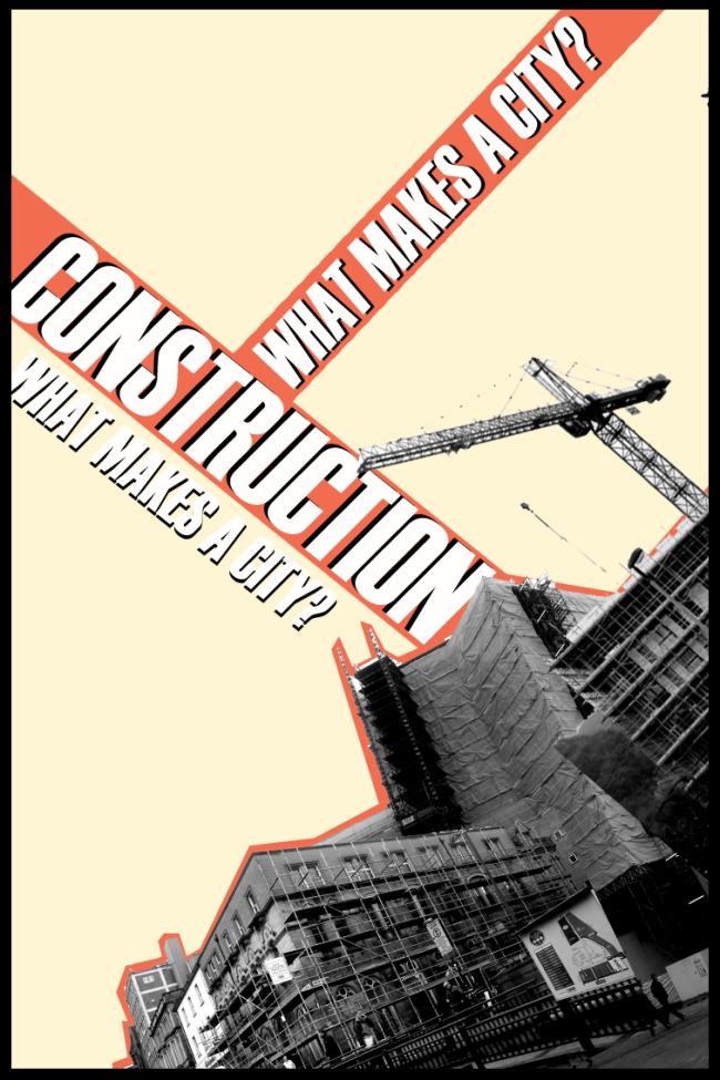
As part of my What Makes A City project I decided to conduct some more artist research and research on techniques. I chose the artist Aleksander Rodchenko, a Russian graphic designer who specialized in collages and the use of pictures in his work. He also used a lot of diagonal structures in his work giving the work interest. For this piece I used my original construction themed pictures and used the magic wand tool to remove the white backgrounds. I then used the transform tool to rotate each picture and layer them on top of eachother. I used the paint tool to cover the background in a colour and added text.
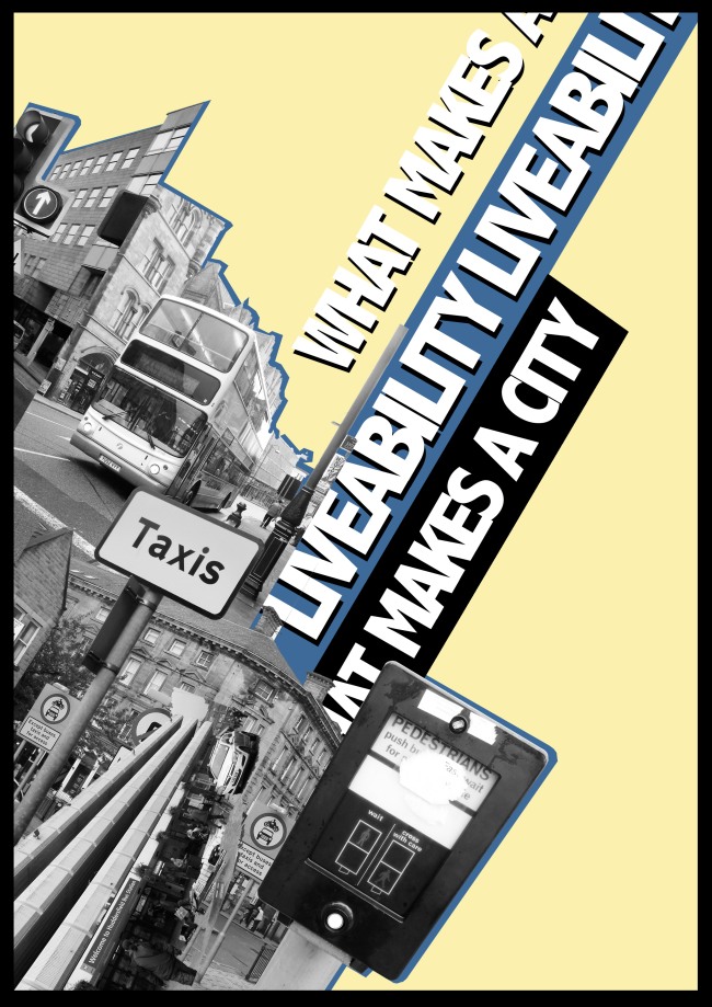
After I had finished my first interpretation of his work I then decided to experiment further to make my ideas even better . For my next piece I decided to use a set angle of 30 degrees. This meant that all my pictures were on the same slant and I felt that everything was much neater and ordered. I also experimented with colours; I chose an off blue and an off yellow which I felt contrasted each other heavily and would imitate the kind of contrast that Rodchenko uses in his colours. I also used a lot more black in this image as I feel that black areas make an image stand out more and fill the negative spaces in so that the image doesn’t look plain.
For my second improved piece I decided to experiment with symmetry; I copied the original set of images I had used and flipped the canvas, so that the images were a complete opposite. I then copied the original image and placed it next to the flipped image so it created a perfect symmetrical graphic. I again experimented with colours and chose colours which this time complimented each other, which also worked in my designs. I again experimented with text, and this time made symmetrical typefaces across the top of my image. I felt that by experimenting with different methods I have broadened my ideas and expanded on my research of this artist .
